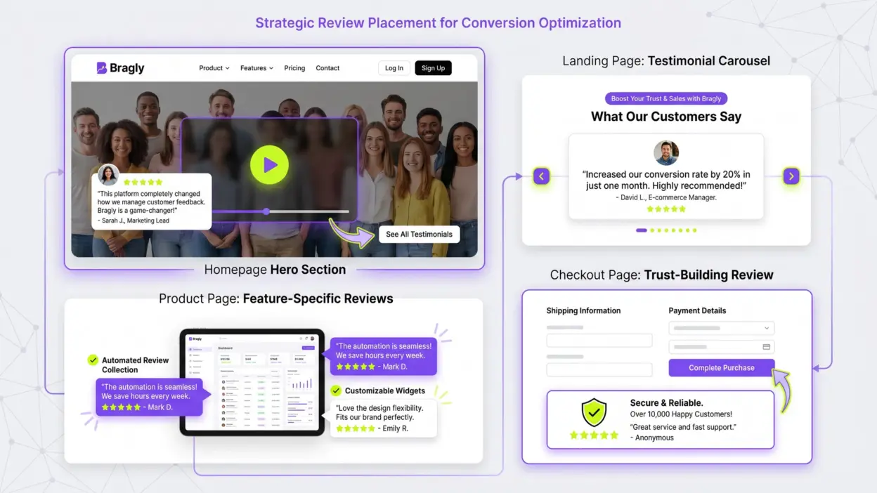
Looking for a Shorter Overview?
AI Summary
Key Moments
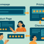
Power of Strategic Placement
Review placement affects conversion rates far more than the content itself, emphasizing visibility at key decision moments.Tailored Reviews on Product Pages
Showing feature-specific reviews boosts credibility by addressing exactly what the prospect is considering.Checkout Page Reviews Reduce Friction
A single positive review about the buying experience can eliminate last-minute hesitation and increase conversion.Common Placement Mistakes
Avoid hiding reviews below the fold, repetitive display, mixing formats poorly, and stale content to maintain trust.Your best salespeople aren’t on your payroll. They’re your customers. But here’s the thing—most businesses hide them.
You collect reviews. You have testimonials. But then you stick them on a single page nobody visits, or worse, you don’t display them at all. That’s leaving revenue on the table.
Review placement isn’t complicated. But it’s not intuitive either. Put them in the wrong spot and they do nothing. Put them in the right spot and they move the needle on conversions.

Here’s the complete guide to displaying reviews where they actually matter.
Key Takeaways
- Homepage: Lead with 2-3 video testimonials above the fold, then stack 10-15 text reviews below to build volume
- Product pages: Show reviews tied to specific features. A prospect looking at “automation” sees proof about time saved
- Landing pages: One powerful testimonial at the top for attention, then 5-10 below for proof through volume
- Checkout: A single review about the buying experience (“Fast checkout, arrived in 2 days”) removes last-minute friction
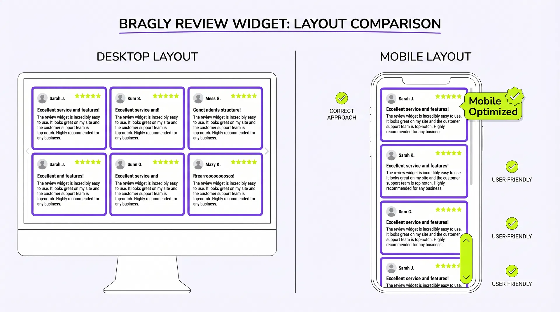
- Mobile: Use vertical scroll or carousel layouts, not grids. Grids don’t work on small screens
- Common mistake: Hiding reviews below the fold or only on your homepage. They need to be everywhere
Why Review Placement Matters More Than You Think
Conversion rate optimization is 80% placement, 20% content.
You could have the most compelling customer testimonial ever written. But if it’s on page 4 of your website, it does nothing. Nobody sees it.
A prospect lands on your homepage. They have 10 seconds to decide if they trust you enough to keep scrolling. That’s when reviews matter most.
The data backs this up. Companies that display reviews prominently see 20-40% higher conversion rates than those that hide them. That’s not marginal. That’s real revenue.
But here’s what most businesses get wrong: they think reviews are a homepage feature. They’re not. Reviews belong everywhere a prospect might hesitate.
Homepage: Build Trust Above the Fold
Your homepage has one job: convince a stranger to stick around.
Reviews do that. Specifically, video reviews do that.
When a prospect sees a real person on camera saying “This saved my business $50K a year,” the distance to purchase shrinks instantly. That’s why video testimonials convert 50-80% better than text.
But you can’t show just one video. One testimonial feels like a cherry-picked outlier. Three to five videos feel like a pattern.
Here’s the winning formula for homepages:
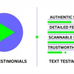
Above the fold: 2-3 video testimonials in a carousel or single-review layout. Video builds trust fast.
Below the fold: 10-15 text testimonials in a grid or list. Text provides volume. Prospects scan the list and think, “Okay, this is legit.”
Why both? Video grabs attention. Text proves it through volume.
If you’re using Bragly’s carousel widget, you can set it to rotate through your best video testimonials automatically. Every visitor sees something different. That’s better than showing the same video to everyone.
Text testimonials below can be filtered by rating or keyword. A prospect looking for proof that your product is “easy to use” sees reviews specifically about ease. That’s powerful.
Product Pages: Show Reviews That Match the Feature
A prospect is looking at your “automation” feature. They want to know: will this actually save me time?
That’s when they need to see a review from someone who used automation and saved time. Not a generic review. A specific one.
This is where most businesses fail. They show the same generic reviews on every page. That’s a missed opportunity.
Instead, tag your reviews by feature or use case. Then display reviews on the product page that match what the prospect is looking at.
Example: A prospect is on your “reporting” page. They see this review: “The reporting dashboard is incredibly intuitive. I set up custom reports in under 5 minutes.”
That review is 10x more persuasive than a generic “Great product!” testimonial.
If you’re collecting reviews through a form, ask customers which features they loved. Then filter and display reviews by feature on each product page.
Landing Pages: Lead with Your Best Review
Landing pages are high-intent. A prospect clicked an ad or email. They’re ready to convert.
But they still need one more push. That’s where reviews come in.
Lead with your single best testimonial. The one that directly addresses the pain point your landing page solves.
If your landing page is about “saving time,” show a review that says “This saved me 10 hours a week.”
Below that, add 5-10 additional reviews to build proof through volume. A carousel works well here. It keeps the page from feeling cluttered while showing multiple perspectives.
One video testimonial at the top, then text reviews below. That’s the formula that converts.
Checkout: The Forgotten Trust Opportunity
Your prospect is one click away from buying. But they’re hesitating.
That’s the perfect moment for a review.
Most businesses leave the checkout page blank. No reviews. No social proof. Just a form asking for money.
Add a single review about the buying experience. Something like: “Fast checkout, arrived in 2 days” or “Easy refund process, no questions asked.”
That one review removes friction at the critical moment.
Email & Marketing: Reviews Everywhere
Reviews aren’t just for your website. They belong in your marketing too.
Pull a compelling quote from a video testimonial and put it in your welcome email. Use a short review in your ad copy. Feature a customer story in your newsletter.
The more places prospects see social proof, the more they trust you.
Mobile: The Placement Everyone Gets Wrong
Here’s a stat nobody talks about: 60% of website traffic is mobile.
But most review widgets are designed for desktop. They look terrible on phones.
Grids don’t work on mobile. A 3-column grid becomes a 1-column mess. Carousels work better. Vertical scrolls work better.
If you’re displaying reviews on mobile, use a layout that adapts to the screen size. A carousel that scrolls horizontally on desktop should scroll vertically on mobile.
Bragly’s widgets are responsive by default. They adapt to any screen size. That’s table stakes in 2026.
Common Placement Mistakes (and How to Fix Them)
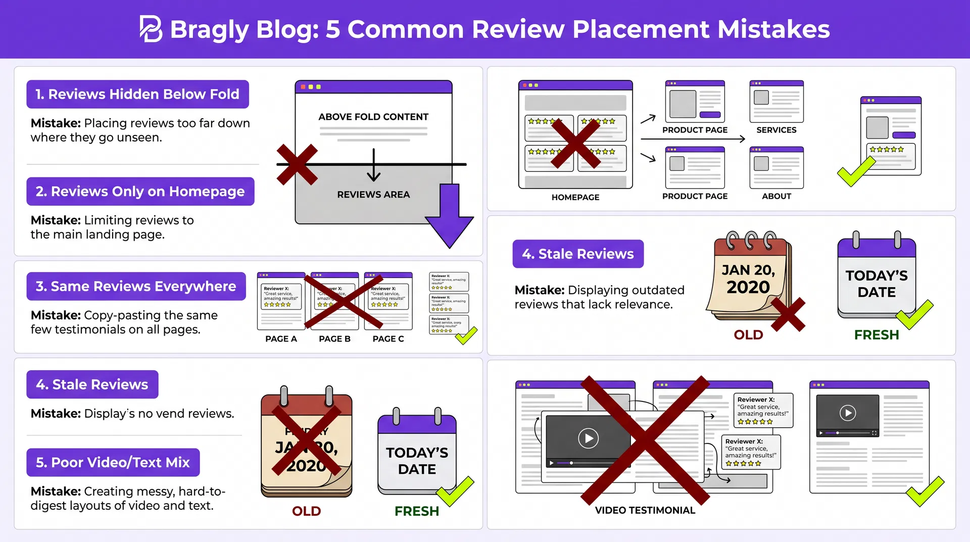
Mistake 1: Hiding reviews below the fold
A prospect lands on your homepage and scrolls down to find reviews. By then, they’ve already decided. Reviews need to be visible immediately.
Fix: Place your best reviews above the fold. Video testimonials especially.
Mistake 2: Only showing reviews on your homepage
Your product pages, landing pages, and checkout are where conversions happen. Reviews belong there too.
Fix: Display reviews on every page where a prospect might hesitate.
Mistake 3: Showing the same reviews everywhere
Repetition kills trust. A prospect sees the same three testimonials on every page and thinks, “That’s all they have?”
Fix: Rotate reviews. Show different testimonials on different pages. Use filtering by feature or rating.
Mistake 4: Not updating reviews regularly
A prospect sees a review from 2023 and thinks, “Is this company still around?” Stale reviews kill trust.
Fix: Display the date on reviews. Prioritize recent reviews. Update your widget automatically when new reviews arrive.
Mistake 5: Mixing video and text poorly
Video and text serve different purposes. Video builds trust. Text provides volume. But if you mix them wrong, they compete instead of complement.
Fix: Lead with video (above the fold). Follow with text (below the fold). On product pages, use text filtered by feature.
Final Thoughts: Your Placement Action Plan
Review placement is simple. But it’s not obvious. Most businesses get it wrong.
Here’s what to do next:
This week: Audit your website. Where are you showing reviews right now? Homepage only? Nowhere? Start there.
Next week: Identify your best 3-5 video testimonials. Place them above the fold on your homepage.
Week 3: Add 10-15 text testimonials below the fold. Use a carousel or grid layout.
Week 4: Add reviews to your top 3 product pages. Filter by feature if possible.
Week 5: Add a single review to your checkout page about the buying experience.
The data is clear. The strategy is simple. The only thing left is to start.
Ready to display your reviews strategically? Bragly makes it easy. Collect reviews from 33+ sources, display them with 10+ widget styles, and update automatically when new reviews arrive. Try it free.