Looking for a Shorter Overview?
AI Summary
Key Moments
Impact of Rating Format on Data Quality
The rating scale format affects response interpretation, completion speed, and analytical usefulness.Five Core Rating Format Families
Stars, numeric scales, sliders, descriptive anchors, and binary-midpoint each uniquely shape feedback.When to Use Different Scale Lengths
Five points works widely, but 6-7 points offer finer discrimination, fewer points work for directional clarity, and N/A options handle unknowns.Implementation Best Practices
Test labels, rendering, edge cases, and analytics wiring to ensure scale validity and operational effectiveness.You ship a new checkout flow, add a five-star widget because it feels familiar, and move on to the next release. A few days later, the dashboard is full of top ratings, support managers can’t separate “acceptable” from “exceptional,” and product decisions are being made from a number that looks precise but says very little.
That outcome isn’t caused by stars alone. The format is part of the measurement instrument. It influences how quickly people answer, whether they use the middle option, how responses appear in reports, and whether your team can distinguish a mild preference from a strong one. The right choice among 5 scale rating options depends on the decision your data needs to support
Why Your Rating Scale Choice Matters More Than You Think
A founder usually chooses a rating format for a visible reason. Stars look familiar on a review card. Numeric buttons fit neatly into a survey form. Emojis make a support question feel less formal. Those choices can improve the surface experience, but they also shape the answers underneath.
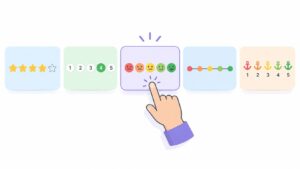

A five-star review is commonly treated as a five-point ordinal scale, with ratings from 1 to 5 stars aggregated into an average score for a product or service evaluation (review research on five-star ratings). That average is useful for quick comparison, but it doesn’t automatically tell you whether a customer felt “fine,” “very happy,” or just wanted to finish the form.
The hidden trade-off
A visual star widget encourages fast recognition. A numeric scale makes the underlying value obvious. Fully labeled options slow the respondent slightly, but they make your intended meaning clearer. A neutral midpoint gives people a legitimate way to express ambivalence, while a forced-choice scale removes that escape route and can create a sharper directional result.
The historical staying power of five options isn’t accidental. Early measurement methods used five categories as a practical balance between discrimination and simplicity, and the original Likert scale introduced a five-point agreement format in 1932 (history of rating scales). The format survived because most respondents can make a rough judgment across five meaningful positions without having to debate tiny differences.
Practical rule: Choose the format for the decision you’ll make with the response, not for the widget your competitors happen to display.
If you need public proof, stars may be appropriate. If you need a reliable internal signal, descriptive labels may be better. If you need more separation between close opinions, five points may be too coarse. The rating control isn’t decoration. It’s the lens your team will use to read customer sentiment long after launch.
The Five Core Rating Format Families
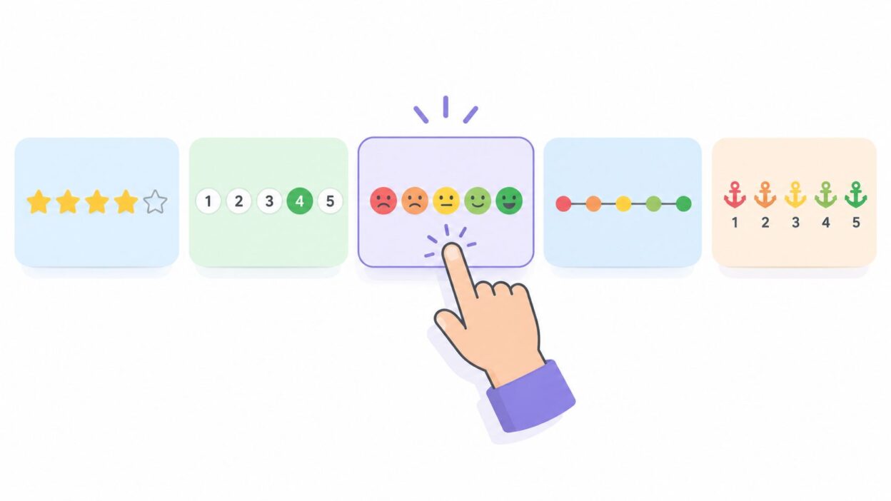
Most five-option controls fall into five practical families. You don’t need to treat them as interchangeable, because each family asks respondents to interpret the same judgment in a different way.
Star widgets use five icons that fill from left to right. They work well for product reviews and public testimonials because users recognize the visual language immediately. Stars also compress neatly into cards, grids, and review summaries. If you’re publishing collected feedback, a star rating calculator can help you inspect how individual values roll into an overall display.
Numeric scales show values such as 1 through 5, or 0 through 5 when the starting point has a deliberate meaning. They suit CSAT, onboarding feedback, and operational surveys because raw values are easy to store, filter, average, and map into reporting rules. Numeric controls feel more neutral than stars, but they need clear endpoint labels.
Slider scales let a respondent drag a handle along a track. They look flexible, although many teams ultimately convert the position into five reporting buckets. Sliders can create unnecessary precision if the interface suggests continuous measurement but the analysis only recognizes five categories.
Descriptive anchors label choices with language such as “Very dissatisfied” through “Very satisfied,” or “Poor” through “Excellent.” This is the strongest option when interpretation matters more than visual speed. For teams designing structured feedback for teams, the labels should describe the construct consistently, not merely decorate the endpoints.
Binary-with-midpoint controls combine positive and negative actions with a neutral center. Thumbs up, neutral, and thumbs down are a compressed five-point model: respondents can signal direction quickly, but only a small share of the scale carries rich nuance.
Why five remains a practical default
Five points avoids the forced-choice problem of a four-point scale while keeping the task simpler than a longer scale. Research syntheses commonly place practical survey formats in the 5 to 7 point range, and response-science guidance recommends five points for unipolar questions such as satisfaction because shorter scales can reduce reliability while gains tend to level off after roughly seven points (survey scale synthesis; response-scale guidance).
Use five when you need a neutral option, familiar benchmarking, and manageable completion. Don’t assume it captures every meaningful distinction.
Stars vs Numeric vs Descriptive Anchors Compared
The useful comparison isn’t “which format looks nicest?” It’s whether the control produces enough signal without creating avoidable friction. Stars usually win on recognition. Numeric buttons win on data handling. Descriptive anchors win when respondents could interpret the same word differently.
| Format | Discrimination | Neutrality Bias | Mobile Usability | Analytics Granularity |
|---|---|---|---|---|
| Stars | Low to moderate, with frequent top-box clustering | High risk of positive skew | Strong, especially for one-tap review input | Clean raw values, but public averages can hide distribution |
| Numeric 1–5 | Moderate, with clear ordered values | Moderate, especially around the midpoint | Strong when buttons are large and close together | Strong for filtering, averages, and custom buckets |
| Emoji | Low to moderate, depending on labels and culture | Can push emotional interpretation toward extremes | Strong when icons have text labels | Usable for broad sentiment, weaker for nuanced analysis |
| Descriptive anchors | Moderate to strong, because each option carries meaning | Lower if all points are labeled clearly | Fair, though text takes more space | Strong for semantic tagging and agent interpretation |
Stars
Stars are the right default for public review collection when recognition and display speed matter. Their weakness is interpretation. A customer may treat four stars as praise, while an internal team treats it as a warning that the experience fell short.
Numeric controls
Numeric 1–5 buttons are better for product teams that plan to segment results. You can preserve the exact answer, distinguish the midpoint from adjacent values, and define reporting rules without guessing what an icon meant. Add endpoint labels, and make the question itself unambiguous.
Emoji and anchors
Emoji controls reduce the emotional distance of a support survey, but don't rely on facial expressions alone. Pair each icon with accessible text, because the same visual can carry different cultural or personal meanings.
Descriptive anchors are my choice for support CSAT when agents need to understand the customer's language. They can create more visual density on mobile, but that cost buys clearer interpretation.
Choose stars for public recognition, numbers for operational analysis, and words for interpretive clarity.
UX and Completion Rate Trade-offs
A rating control succeeds only if people can understand it, reach it, and submit it without hesitation. The difference between tapping a star and selecting a labeled sentence becomes obvious on a small screen. A compact visual control may fit comfortably within the thumb zone, while a fully labeled scale can push the submit action below the fold.
Research on rating-format presentation shows that numerical and analog displays can change choice likelihood, purchase intent, and ad-click likelihood when ratings sit at the top end of a five-point scale (rating-format effects across nine experiments). The practical lesson is direct: presentation isn't neutral, even when the underlying values are identical.
| Format | Completion Rate | Mobile Usability | Accessibility Score |
|---|---|---|---|
| Stars | Usually fast for familiar review tasks | Strong with large, separated targets | Requires explicit labels and state announcements |
| Numeric 1–5 | Strong in survey contexts | Strong when presented as a horizontal button group | Strong with visible labels and keyboard support |
| Emoji | Fast for emotional reactions | Strong if icons and text remain readable | Needs text alternatives and clear selected states |
| Descriptive anchors | Can require more reading | Moderate, especially on narrow screens | Strongest when every option has semantic text |
| Slider | Variable because dragging adds effort | Risky when the track is small or imprecise | Requires careful keyboard and screen-reader handling |
Design for the first tap
Place the entire control where a thumb can reach it without scrolling. Use generous tap targets, visible focus states, and a selected state that doesn't depend on color alone. For stars, distinguish empty, selected, hover, and partially filled states through text and accessible labels, not just shades of the same color.
A screen reader should announce both the question and the selected value. “Four stars” is useful. “Selected” with no value isn't.
Keep one rating decision per interaction block. Stacking several widgets together makes respondents scan repeatedly and fragments your event data. If your form needs multiple questions, group related items and keep their labels consistent. A no-code form system such as Bragly Forms can be evaluated against those requirements before you commit to a production layout.
Don't confuse speed with quality
A fast tap is valuable when the task is a public review. It isn't automatically valuable when the answer drives product prioritization. If users finish quickly because the control is ambiguous, your completion metric improves while your decision quality declines.
Analytics and Sentiment Implications
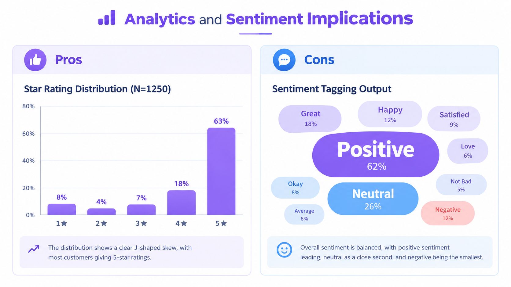
The same response can produce very different dashboard behavior depending on how you collect and transform it. A star average is easy to show, but averages can conceal whether responses are concentrated at the top or spread across the scale. Numeric values preserve ordering, yet your team still needs explicit rules for what each range means.
Online star ratings often follow a J-shaped distribution, with five-star reviews dominating and one- to three-star reviews appearing much less often (research on positivity bias in star ratings). That pattern makes a public score look healthy while leaving limited room to distinguish “good” from “excellent.”
Store the raw response
Never keep only the average. Store the original value, the format version, the question text or identifier, and whether the person selected N/A. A dashboard can calculate an average later. It can't reconstruct the distribution after you discarded the underlying answers.
For CSAT, define whether you report the mean, the share of favorable responses, or both. For NPS-style reporting, don't casually convert a five-point satisfaction item into promoter and detractor groups as if it were the native NPS instrument. If your business requires NPS, use a scale and question designed for that purpose, then document the mapping.
Emoji responses need extra care. They can support broad sentiment tagging, but they don't guarantee consistent emotional interpretation across markets. Pair the rating with open text when the reason behind the score affects the next action. Teams handling that workflow can use a sentiment analysis API guide as a technical reference for connecting text feedback to downstream classification.
You can also compare rating values with text-derived sentiment in a review sentiment analyser, but treat disagreement as a useful signal. A high rating with negative text may indicate politeness, a misunderstood question, or a problem the scale failed to expose.
When Five Points Is the Wrong Choice
Five points is a good default. It isn't a universal law.
Use more points when the decision depends on separating close opinions. Guidance and comparative research indicate that 6- or 7-point scales can provide better discrimination and reliability in some settings, especially when a middle-heavy result would prevent researchers from seeing meaningful spread (comparison of response-scale lengths). A seven-point format makes sense for complex B2B research, nuanced product positioning, or expert evaluation where respondents can reliably distinguish finer gradations.
Add N/A instead of manufacturing an opinion
A midpoint isn't a substitute for lack of knowledge. If a customer hasn't used a feature, a buyer hasn't spoken with sales, or an employee can't evaluate a policy, forcing a neutral response pollutes the result. Add a true N/A or “not enough information” option and exclude it from scored calculations.
The risk is particularly high in satisfaction surveys, where respondents may select the middle value because none of the other options fit. Survey guidance recommends a genuine N/A choice when people may lack the information needed to answer (CSAT question design guidance).
Use fewer points when direction is all that matters
A four-point forced-choice scale can be appropriate when neutrality itself creates ambiguity, such as sensitive research that requires a directional judgment. A three-point Poor, Okay, Good control works for rapid usability checks where the team needs a quick signal rather than fine-grained measurement.
The rule is simple: use five for comparability, more points for discrimination, fewer points for clean direction, and N/A for non-experience.
Recommended Scale by Use Case
Your business scenario should determine the control. Don't force every audience into the same widget just because one format is easier to configure.
| Use Case | Recommended Format | Why It Wins | Watch-Out |
|---|---|---|---|
| SaaS NPS and onboarding feedback | Numeric 1–5 or 0–5 with clear anchors | Raw values are easy to segment and connect to onboarding events | Don’t blur a satisfaction score with the native NPS method |
| E-commerce product reviews | Five stars, with an optional half-step if your system supports it | Shoppers scan visual ratings quickly and recognize the format immediately | Monitor top-box clustering and review-context effects |
| Support CSAT after tickets | Emoji with text, or fully descriptive anchors | The control feels approachable and gives agents language they can interpret | Emoji meaning can vary, so keep text labels available |
| Local services and B2B feedback | Descriptive five-point scale or numeric values with word anchors | Linguistic clarity helps respondents who don’t rely on visual shortcuts | Longer labels need responsive layout and screen-reader testing |
SaaS onboarding
Use numeric values when the team will compare feedback by onboarding stage, account segment, or feature path. Put the construct in the question, such as ease, confidence, or satisfaction, and don't let one generic score stand in for all three.
E-commerce reviews
Stars belong on the public review surface because users understand them at a glance. Keep the raw value and review text together, since the written explanation often reveals what the star average hides.
Support CSAT
Emoji can reduce emotional friction after a difficult support interaction, but pair each icon with words such as Very dissatisfied through Very satisfied. That gives the customer a fast visual choice and gives the support team a stable semantic reference.
Local and B2B services
Use words when the audience may interpret numbers idiosyncratically. “Below expectations,” “meets expectations,” and “exceeds expectations” give the response a business meaning that a bare four may not carry.
Implementation Checklist and Final Recommendation
Before launch, test the widget as a production component, not as a screenshot. Confirm the labels, raw values, keyboard behavior, and analytics events across device sizes.
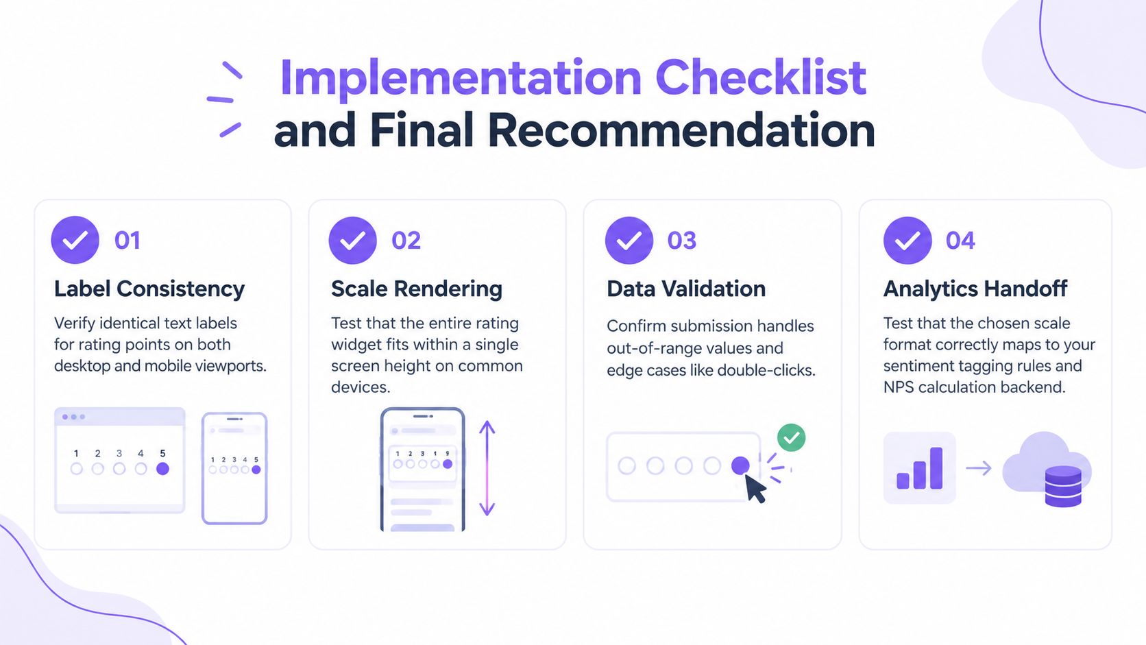
- Check label consistency: Use identical meanings on desktop and mobile, including endpoint and midpoint wording.
- Test scale rendering: Make sure the complete control fits comfortably on common small screens and remains easy to tap.
- Handle N/A and edge cases: Decide how opt-outs, double clicks, missing values, and out-of-range submissions behave.
- Wire raw analytics: Send the selected value and format version, not only the calculated average.
Pricing matters when response volume grows. Many SaaS widgets charge per response above a free tier, so a higher-friction descriptive scale can affect operating cost as well as completion. Review the plan limits before you make the format part of a high-volume campaign.
Choose stars when recognition and public proof matter most, numeric controls when neutral analysis matters most, and descriptive anchors when interpretation or completion is the bottleneck. Skip five points when your decision needs more discrimination than five categories can carry.
Bragly helps teams collect, organize, analyze, and display customer reviews and testimonials through review forms, source aggregation, analytics, and no-code website widgets. Visit Bragly to evaluate a practical workflow for turning rating data and written feedback into usable social proof.