

Looking for a Shorter Overview?
AI Summary
Key Moments
Effective carousel use cases
Use carousels only in narrow spaces with standalone reviews, not when comparison or detailed reading is needed.Accessibility and autoplay control
Set autoplay optional, provide visible pause/play controls, and ensure keyboard and screen reader compatibility.Selecting genuine and relevant reviews
Lead with relevant, nuanced reviews that include concrete details and represent authentic customer experiences.Measuring carousel performance accurately
Track exposure per slide, interactions, dwell time, and segment data by device and visitor type to understand effectiveness.The most popular advice about a carousel review is to add more testimonials and let them rotate. That gets the decision backwards. A carousel earns its space only when the first slide carries relevant proof and the layout gives the page something a static quote or grid cannot.
If a buyer needs to compare customers, read a detailed account, or find a review from a similar business, rotation can hide the evidence they came to see. Decide whether the format fits the page before choosing a widget, its colors, or its embed code.
When a Review Carousel Earns Its Place
A carousel is a space-saving compromise, not a proof multiplier. Use it when the column is narrow and each review can stand alone: beside a buy box, in a pricing sidebar, or on a local homepage where three cards would crowd the page. It is weaker when the buyer needs to compare customers, read a full account, or hunt for feedback from a matching industry.
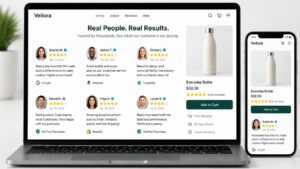

Rotation has a cost. Every slide after the first asks for a click most visitors will not give. Research summarized by The Good found that only about 1% of visitors clicked non-rotating image carousels, and 84% of those clicks went to the first slide. For auto-rotating carousels, the first slide still received 40% of clicks. More cards in the widget do not mean more proof reaches the buyer.
Results vary by site, so a carousel helps only when its first review fits the visitor and its position makes sense, not just because it rotates. If the opening card would not persuade on its own, motion will not rescue it.
| Page situation | Better layout | Why |
|---|---|---|
| Narrow column and short standalone reviews | Carousel | One proof at a time when several cards cannot sit side by side |
| Buyer comparing several customers | Grid or mosaic | Multiple reviews stay visible without a click |
| One decisive proof point | Static quote | Extra slides are rarely seen because attention sticks on the first card |
| Visitor needs a matching industry or use case | Filtered static set | Relevance beats cycling unrelated praise |
| Long reviews, disclosures, or reduced-motion audience | Static block | Reading shouldn't be cut off by motion |
| Hero already full of offers and the main button | No carousel | Critical claims and the call to action stay outside any rotator |
Treat the carousel as supplementary proof
Keep the main claim, pricing cue, and primary button outside the widget. Baymard's benchmark of leading ecommerce sites found that 33% used homepage carousels, while 46% of those carousels had usability-performance issues, according to its homepage carousel analysis. A rotating review should support the decision already forming on the page, not carry the whole case.
Choose the slide that would still work if no visitor ever swiped. If that proof needs neighbors to make sense, use a grid or filtered set. If one relevant review can carry the slot and space stays tight, the carousel earns its place.
Embed the Carousel on Webflow, WordPress, Wix, or Custom HTML
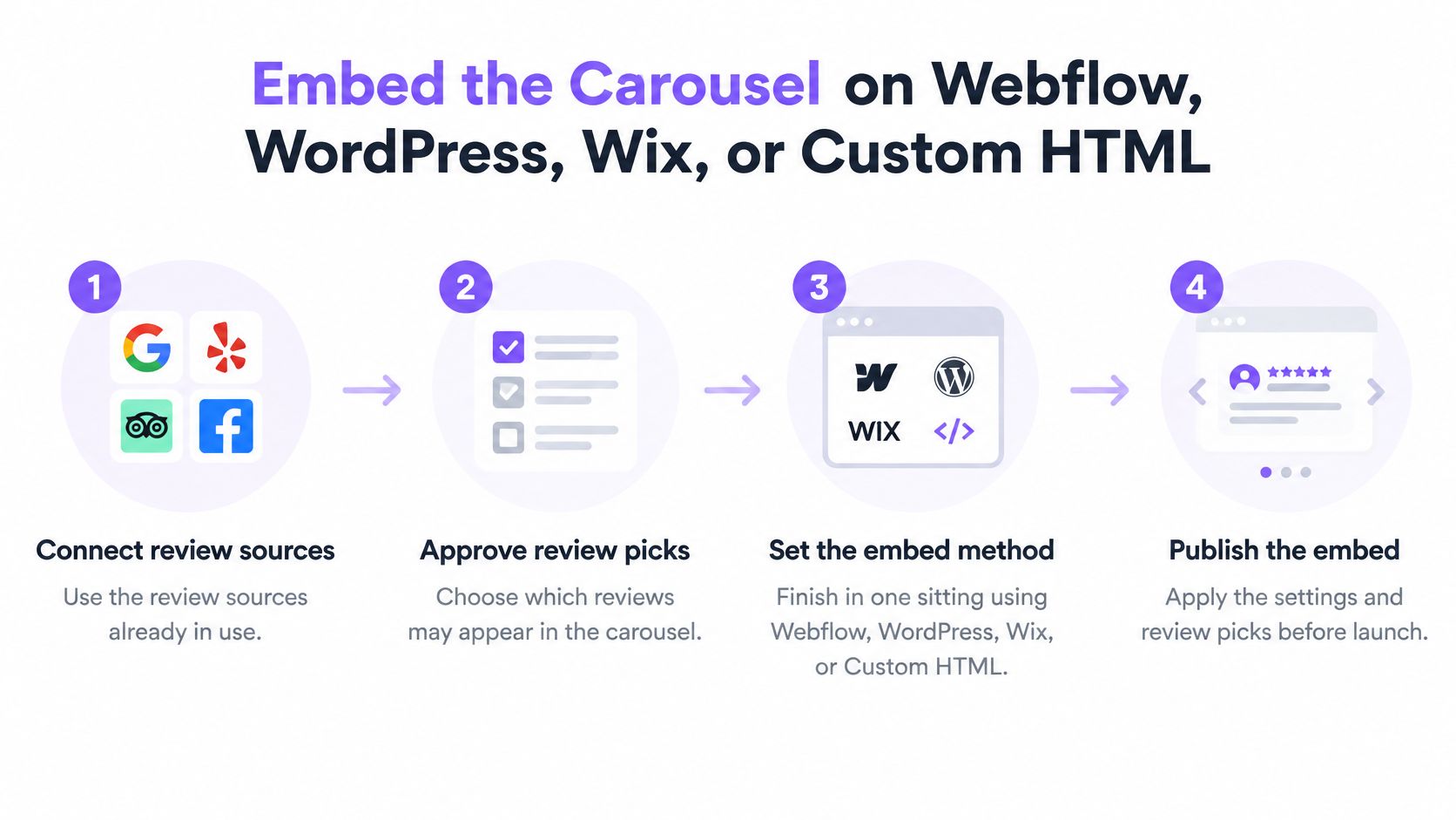
Set the content and behavior first, then add the widget where the layout can support it. That keeps the implementation from turning into a styling exercise around reviews that don't fit the page. Follow the steps in order and stop when the live preview works cleanly.
Prepare the reviews and widget
Connect the review sources you already use. Decide which feedback is approved for public display before adding it to the carousel. A review that hasn't been approved shouldn't reach the live widget.
Filter to the set that fits this page. Tag reviews by industry, product, or use case, then select the relevant group. Show reviewer photos only when the images look consistent with the widget's design.
Choose a layout and match the site. Set the colors and style to fit the surrounding page. A widget that clashes with the site can look like an ad instead of part of the experience. Bragly customers choose which reviews to show, style the widget to match their site, and paste a single line of HTML wherever they want the reviews to appear. Its pricing page lists 34 widget layouts, including Atlas Quotes, Avatar Marquee, Badge, Carousel, Grid, Marquee, and Spotlight Carousel.
Add the embed to the page
In WordPress, add a Custom HTML block in the target section and paste the embed code. Check that the block sits within the intended column rather than stretching across the page.
In Webflow, place an Embed element in the column and publish the page. Preview the live page as well as the designer view, since a design preview can miss problems that appear after publishing. If you're building in Webflow, Bragly's Webflow platform details can help you identify the relevant setup.
In Wix, add an HTML embed and set its width to the column. Then preview the page on mobile. A full-width embed in a narrow section can push the buy button out of its intended position.
On a custom site, paste the snippet where the carousel should render and give its container a fixed minimum height. Without space reserved for the widget, its content can load late and push the rest of the page down.
Test the published page. Tab through the controls, make sure mobile autoplay is off, and confirm the visible stars match the selected reviews. Don't add a second review widget to the same screen just because there's room for another embed.
Keep ratings honest
If you add review structured data, make sure it describes genuine customer feedback that's disclosed on the page. Google's review snippet documentation says pages must not include fake or undisclosed incentivized reviews in their content or structured data; misleading markup can make a page ineligible for review-rich results. The stars in the markup should match real reviews, not a different or more favorable set.
Once the live preview looks right, stop. A working widget in the intended column is a better result than multiple embeds that compete for attention. If you use Shopify, adding Bragly review widgets from sign-up through pasting the embed code takes under two minutes.
Autoplay Timing and Accessible Controls
Set carousel behavior before publishing, not after a visitor reports that a quote disappeared mid-sentence. An interaction-first carousel gives people time to read and a clear way to move through reviews. Autoplay should be optional, not the mechanism visitors must rely on to see the content.
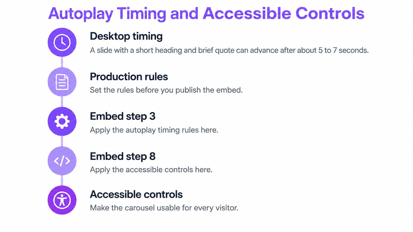
Baymard recommends about 5 to 7 seconds for desktop slides containing a short heading and brief labels, with text-heavy slides potentially needing up to 10 seconds. It also recommends pausing rotation on hover, stopping after active user interaction, and disabling autoplay on mobile. Its carousel navigation guidance advises testing with keyboard navigation, screen readers, reduced-motion settings, slower mobile networks, and real-device touch.
| Setting | Desktop | Mobile |
|---|---|---|
| Autoplay | Optional, 5–7 seconds for short slides, up to 10 seconds for text-heavy reviews | Off |
| Pause | On hover and on keyboard focus; stay paused after interaction | Not used, because autoplay is off |
| Controls | Always-visible previous, next, pause, and position | Same controls, plus swipe, never swipe alone |
| Control size | At least 44×44 CSS pixels | At least 44×44 CSS pixels |
| Reduced motion | Stop rotation or show the first slide only | Stop rotation or show the first slide only |
| Review text | Readable without trapping the main call to action inside the slide | Same rule, larger type, no mid-sentence cutoff |
Make movement user-controlled
If slides advance automatically, include a visible Pause/Play control. WCAG 2.2 requires a way to pause, stop, or hide moving content that starts automatically, continues for more than five seconds, and appears alongside other content. The W3C carousel tutorial also covers controls that work with a keyboard, slide changes communicated to screen-reader users, and a way to stop movement. An arrow that appears only on hover isn't an adequate substitute for a control people can find and use.
Set the carousel to pause when keyboard focus enters and when someone hovers over it. After the visitor interacts, don't restart the motion automatically. Provide previous and next controls, expose the current position and total slide count to assistive technology, and allow swipe gestures without making swipe the only route through the reviews.
Test the actual experience
For people who prefer reduced motion, stop rotation or display the first slide without movement. Keep text large and readable, use sufficient contrast, make focus visible, and ensure each control is at least 44 × 44 CSS pixels. Lazy-load later media, but reserve space for the carousel so that loading doesn't move the page.
Test on a keyboard, with a screen reader, on a throttled mobile connection, and on a real phone. Check that the current review is announced, controls remain visible, and the quote doesn't change while someone is reading. A carousel that completes an autoplay loop hasn't passed. A visitor who can read, pause, move through, and understand which slide is active has.
Reviews Worth Rotating and Reviews to Leave Out
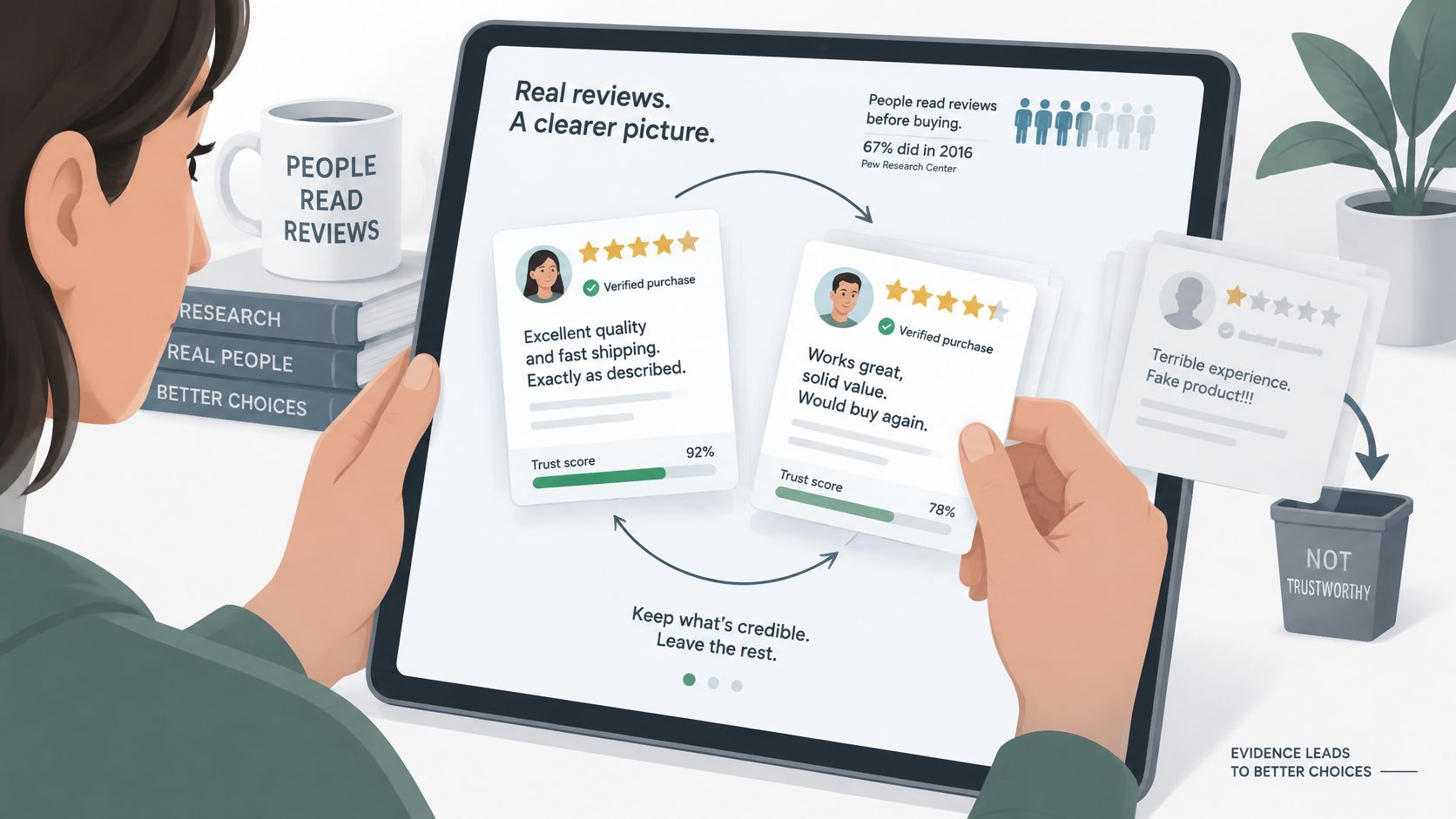
A strip of identical five-star testimonials can look staged, even when the reviews are genuine. In a nationally representative survey published in 2016, 82% of U.S. adults said they at least sometimes read online customer ratings or reviews before a first-time purchase, and 40% said they did so always or almost always, according to the Pew Research Center survey. Reviews can be important purchase information, but a buyer still needs a reason to believe what the carousel shows.
Trustpilot reported that 55% of US consumers and 52% of UK consumers had more faith in imperfect reviews and ratings because less-than-perfect feedback appeared more authentic. The same Trustpilot review research found that 49% of global consumers believed many brands manipulated reviews to improve their reputations. Preserve attribution and meaningful details rather than editing a customer's comment until it reads like polished advertising.
Choose reviews for the page
Start with the buyer's question, then choose feedback that answers it. Nielsen's Global Online Shopping Report found that 57% of online respondents consider reviews before buying consumer electronics; an electronics product page should therefore prioritize feedback about performance, setup, reliability, or compatibility rather than unrelated praise, as explained in the Nielsen report.
A practical review set should have variety without sacrificing relevance:
- Lead with a comparable customer. Put the strongest review for this audience first, not necessarily the one with the most enthusiastic wording.
- Include concrete detail. A customer's role, product use, or specific outcome helps the next buyer judge whether the experience applies to them.
- Keep worthwhile nuance. A detailed four-star review can be more useful than several interchangeable five-star comments. Don't remove a genuine caveat if it explains the customer's experience.
- Tag by audience and use case. A SaaS pricing page and a local service homepage shouldn't open with the same review unless it fits both.
- Leave the transaction essentials outside the slides. Keep guarantees, pricing, and the main button available without requiring a visitor to advance the carousel.
Bragly's review collection tools can help businesses gather customer feedback. Whatever the source, leave out a quote that only makes sense after the visitor has clicked through several unrelated slides. If it needs a long disclosure or substantial context to be understood, give it a static block instead.
Keep Live Reviews in Sync and Measure What Matters
A carousel click total tells you almost nothing. Measure exposure by slide, interaction with arrows or pagination, dwell time, clicks on the call to action outside the widget, and mobile abandonment. Split the results by device, traffic source, and new versus returning visitors. Strong desktop interaction can hide a mobile discoverability problem, and the blended average will not warn you about it.
The standards for the widget stay the same as the standards for the page: the first slide carries the proof, every slide remains manually reachable, and desktop and mobile get tested separately. Benchmarks of homepage carousels have repeatedly flagged usability problems across a large share of tested sites, so treat the rotator as a supplementary review surface and compare it with a static review block in a controlled test before committing to it.
Diagnose the symptom before changing the design
| Symptom | Likely cause | Fix |
|---|---|---|
| Page jumps when the carousel loads | No reserved height while media loads | Set a fixed minimum height and lazy-load only later slides |
| Slide changes while someone is reading | Autoplay still on, or pause only on hover | Stop on focus and interaction; disable autoplay on mobile |
| Quotes are months out of date | Source not connected or sync off | Connect the source, allow background sync, then re-moderate |
| Every card is a perfect five stars | Filtering or manual picks removed all nuance | Add one detailed, attributed review that isn't perfect |
| Screen reader never says which slide is showing | Position and count not exposed | Announce current slide and total, with keyboard previous and next |
| Rich-result stars don't match the widget | Markup includes ratings the page doesn't honestly show | Remove the markup or correct it to genuine disclosed reviews |
New reviews sync automatically in the background to the Bragly dashboard, where you can approve, tag and showcase them from one place. Filtering and moderation control which reviews reach the widget, so a freshly synced review stays out of the rotation until it fits the audience and the display rules. Sync keeps the set current. Moderation keeps it worth reading.
A live display also needs a steady inflow of new material to stay convincing. Businesses gathering more customer feedback can use this practical guide to encourage customers to leave Google reviews, then route the new reviews through the same moderation queue before anything reaches the page.
On the measurement side, Bragly's review analytics dashboard tracks review growth over time, sentiment trends, and the customer keywords appearing across all connected platforms. Pair that with your own slide-level data. The dashboard shows whether the review pool is growing and what customers keep mentioning. Your on-page measurement shows whether anyone saw it.
A clean launch means each slide is manually reachable, the first review matches the audience, the text stays readable, and the layout does not shift as media loads. Give any change a week of real traffic before redesigning again, and check accessibility and page performance alongside conversions.
Pick the Layout and Ship It This Week
If several short reviews fit side by side, use a grid. If the column is narrow and each review is a standalone proof point, use a carousel and choose the opening slide for that audience. Either way, keep the primary button outside the rotator.
Before publishing, run three checks:
- Test controls with a keyboard. Tab to the previous, next, and pause controls. Confirm that the controls are visible and the slide stops moving while focus is inside the carousel.
- Check the phone layout. Open the live page on a phone. Confirm that autoplay is off and the card has enough reserved height not to jump as it loads.
- Read the first three reviews as a stranger. Remove any quote that could belong to any business or doesn't help this visitor decide. Keep the main call to action outside the slides.
After publishing, check slide exposure after a week of real traffic. If later slides still get little attention, switch to a grid rather than adding more testimonials. Bragly's widget library includes single review, carousel, grid, badge, and marquee styles, so the layout can match the space and the reader's task. Getting started is free, and no credit card is required.
Bragly lets you select customer reviews, style a widget to fit your site, and embed layouts such as carousels and grids. Choose the proof your visitors need, then visit Bragly to prepare a review display that fits the page.