

Looking for a Shorter Overview?
AI Summary
Key Moments
Content-first carousel decision
Choose carousel types based on content intent and user needs, not just visual flashy effects.Bragly for review aggregation
Use Bragly to centralize, curate, and sync reviews across pages with minimal dev effort.Accessibility matters
Selecting libraries like Splide emphasizes accessibility to avoid common carousel usability issues.Trade-offs of lightweight vs feature-rich
Balancing ease of implementation, visual effects, and control is key when picking a carousel library.The best carousel isn't always the flashiest. A rotating testimonial strip with fade effects, autoplay, and oversized transitions can look polished in a mockup and still be the wrong choice on a live page. The right pattern depends on review volume, page purpose, keyboard and screen-reader access, mobile behavior, implementation control, and how much script and media weight you're willing to load.
That matters because the common advice around website carousel examples often starts with visual treatment instead of editorial discipline. In practice, the better question is simpler: should this content rotate at all, or would a static proof block, badge, or grid do a better job?
The seven examples below are useful because they represent different ways to solve that decision. Some are full libraries for developers. One is a no-code review platform that handles aggregation, curation, syncing, and display. I'm also avoiding competitor links and keeping the focus on tools you can evaluate for testimonial presentation, accessibility, effort, and performance.


1. Bragly

Bragly changes the carousel decision before any front-end work starts. It is a review collection, moderation, and display platform, so the core question is not which slider effect to use. The question is whether a rotating testimonial block is even the right presentation once your reviews are centralized and reusable across pages.
It supports review imports from multiple public review sources through Bragly, then lets teams curate and publish that proof in several formats. Carousel embeds are part of the product, but they sit alongside grids, badges, sticky widgets, ribbons, video highlights, and a full Wall of Love. That matters if marketing wants one proof source for the homepage, pricing page, and sales collateral instead of separate testimonial assets maintained by hand.
The practical advantage is editorial control. A developer library such as Swiper or Embla helps you define movement, breakpoints, and interaction behavior. Bragly handles the layer underneath that. Which reviews show up, how fresh they stay, who approves them, and whether the same source content can become a slider on one page and a static proof block on another.
Its testimonial widgets for websites are useful for teams that want to test presentation patterns without rebuilding the component each time. If the homepage needs a compact carousel but the pricing page performs better with a badge or short grid, you can change the format without changing your review pipeline.
Where the trade-offs show up
Bragly reduces implementation effort, but you give up some front-end freedom.
- Good fit for small teams and agencies: review syncing, moderation, and embeds remove a lot of manual upkeep.
- Good fit when proof appears in several places: one review source can feed multiple layouts and pages.
- Less flexible than a headless library: if your design system needs custom keyboard behavior, unusual slide logic, or tightly controlled animation, a dedicated carousel library gives more control.
- Worth checking for accessibility and script weight in context: embed platforms save build time, but teams still need to test focus order, controls, reduced-motion behavior, and page-speed impact on their own site.
Bragly also includes review collection forms, manual uploads, tagging, webhooks, analytics, custom domains for a Wall of Love, and AI-assisted review analysis. That broadens its role beyond display. For a founder, marketer, or agency, that can be the deciding factor. If the hard part is maintaining credible testimonial inventory, not coding a slider, a platform like this solves more of the problem than a carousel library alone.
2. Swiper
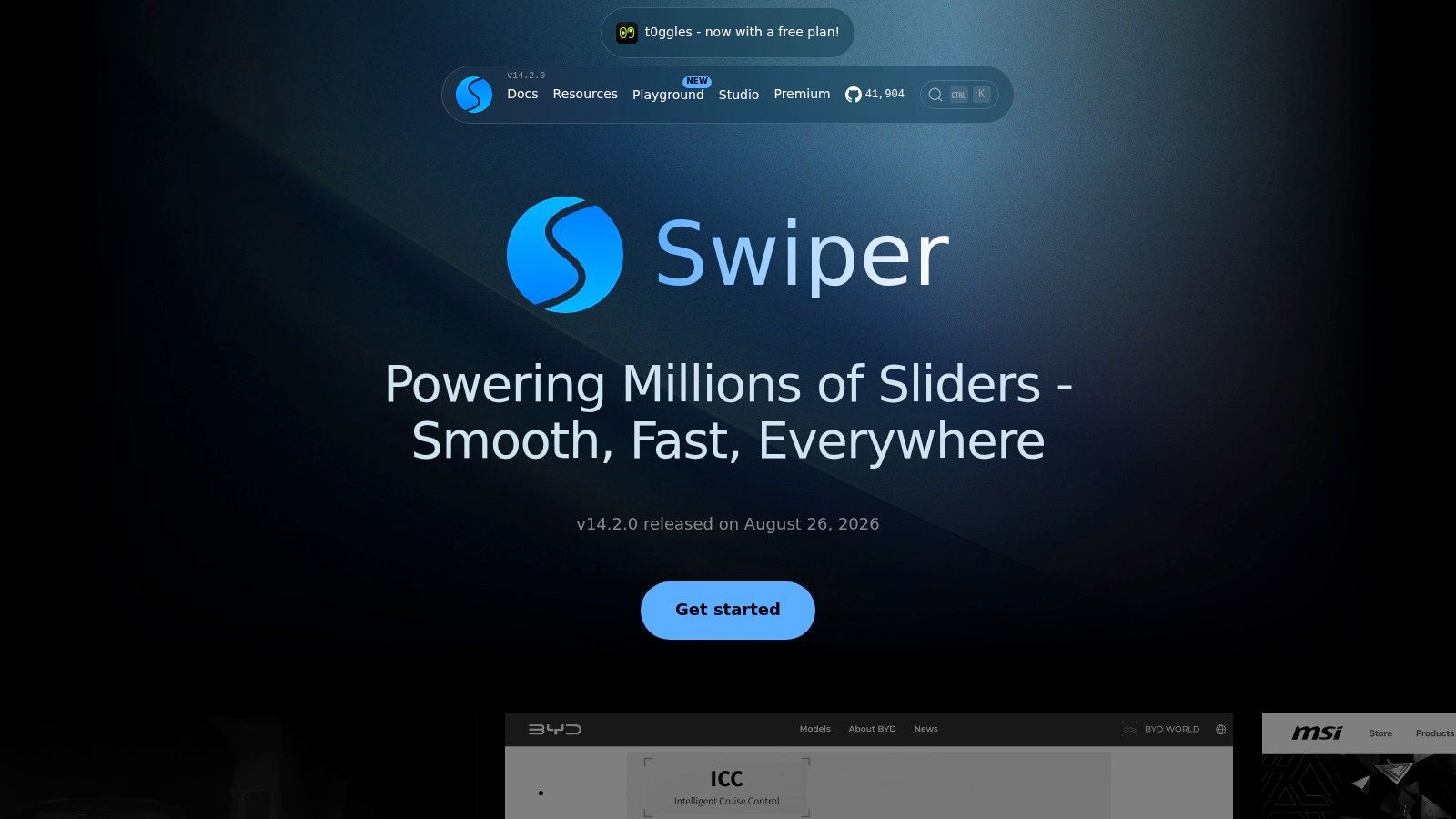
Swiper is one of the most practical choices when you need a mature slider that already knows how to handle touch, breakpoints, effects, and framework integration. It works with vanilla JavaScript, React, Vue, and Web Components, and its demo gallery makes it easy to move from concept to implementation without guessing at the API.
This is the broadest tool on the list. If you need one library that can cover testimonial cards, product galleries, hero banners, thumbnail navigation, RTL, lazy loading, and more, Swiper has the range.
What it's good at
Swiper suits teams that want visual flexibility without building a carousel from first principles. Its modular API supports a lot of patterns marketers ask for, while still being familiar to developers who need to wire it into a larger component system.
A useful way to think about it is this: Swiper is often chosen when the request starts as “we need several kinds of sliders,” not just one testimonial widget.
- Strong demo coverage: You can inspect working variants before committing to one interaction model.
- Framework support: JS, React, Vue, and Web Components reduce integration friction.
- Feature depth: Thumbs, parallax, virtual slides, and lazy-loading cover common ecommerce and content use cases.
For teams deciding between custom display logic and managed proof tools, this usually pairs with a separate review source. If that sounds like your stack, it's worth comparing with social proof software options from Bragly.
Motion can improve discoverability in some contexts, but it also increases implementation decisions. Swiper gives you many levers. That's a strength only if your team will use them carefully.
The trade-off is predictable. Swiper can feel heavy when your real need is a simple testimonial carousel with visible arrows and basic pagination. It's battle-tested, but it's also easy to overbuild.
3. Splide
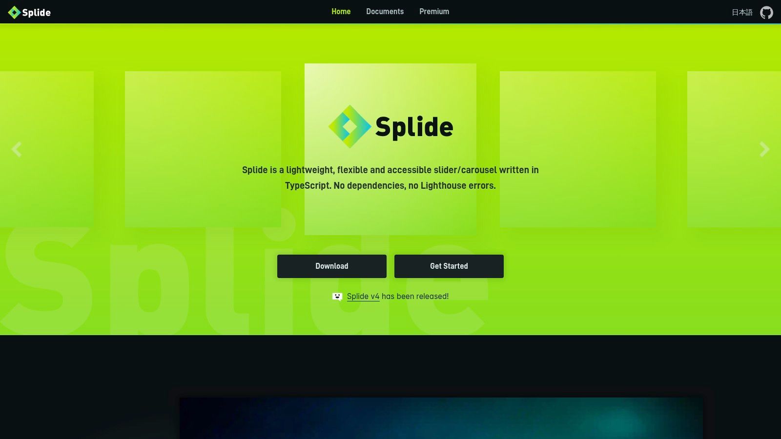
Splide is a cleaner fit when accessibility and lightweight implementation matter more than visual spectacle. It's dependency-free, written in TypeScript, and its documentation spends real time on a11y, i18n, and ARIA instead of treating them like footnotes.
That makes Splide a smart option for testimonial sliders, quote galleries, and product strips where clarity matters more than effects. The examples are also practical. You get default sliders, drag-free layouts, vertical setups, custom pagination, and auto width or height patterns without hunting through scattered snippets.
Why it stands out
A lot of website carousel examples ignore a simple reality. Carousels are common, but they're often implemented badly. Baymard's 2025 analysis found that 33% of ecommerce sites use a homepage carousel, and 46% of desktop and mobile sites with a homepage carousel had usability or UX performance issues. That's the best argument for choosing a library with clearer guidance, not just prettier effects.
Splide helps because it nudges teams toward more deliberate builds.
- Accessibility guidance is built into the docs: That lowers the risk of shipping a visually clean but operationally weak component.
- Extensions cover real needs: Auto-scroll, intersection, video, grid, and URL hash let you expand without changing libraries.
- Framework adapters are ready: React, Vue, and Svelte teams don't need wrappers from third parties.
Where the trade-offs show up
Splide isn't trying to outdo Swiper on ecosystem breadth. It has fewer surrounding extras, and some premium effects live in a sponsor-only repo. For many teams, that's fine. A testimonial carousel usually doesn't need fireworks.
If the page depends on trust, readability, and calm interaction, Splide is one of the better examples to borrow from.
4. Embla Carousel
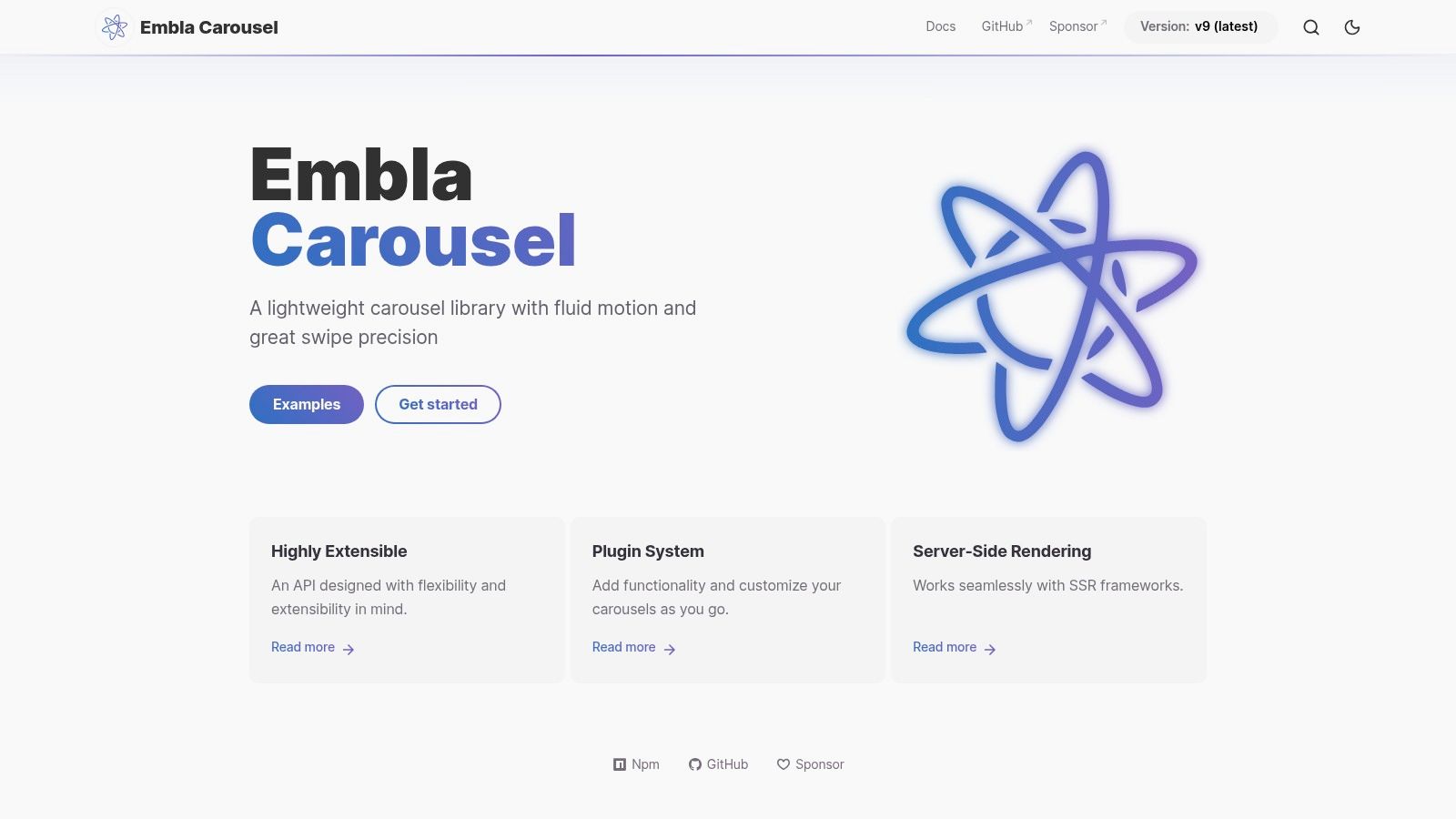
Embla Carousel is for teams that want control, not decoration. It's headless, dependency-free, and designed to drop into a design system without fighting your markup, CSS architecture, or SSR setup.
That makes it especially good for branded testimonial components that can't look like generic plugin output. If your front-end team already owns buttons, pagination styles, spacing rules, and motion tokens, Embla lets them keep that control.
The right use case for Embla
Embla shines when the carousel is just one behavior inside a larger component. You build the structure, decide what counts as a slide, and style every part yourself. The result can feel much more native to the site than a drop-in library with opinionated UI.
That also fits the UX guidance around restraint. Smashing Magazine's carousel guidance notes that autoplay should be avoided, slides should be limited to about three to five, every slide should be manually controllable, and W3C requires pause and resume behavior plus screen-reader announcements. A headless tool makes those decisions easier to enforce consistently.
Design constraint: If content beyond the first slide isn't essential, don't hide critical proof there.
Embla's plugin system covers needs like autoplay, but I'd treat that as optional rather than default. Its real value is precision. Touch behavior feels smooth, the footprint is light, and the output can match a serious design system instead of resembling a borrowed widget.
The downside is effort. You're building the UI yourself, which is exactly why some teams love it and others should avoid it.
5. Keen Slider
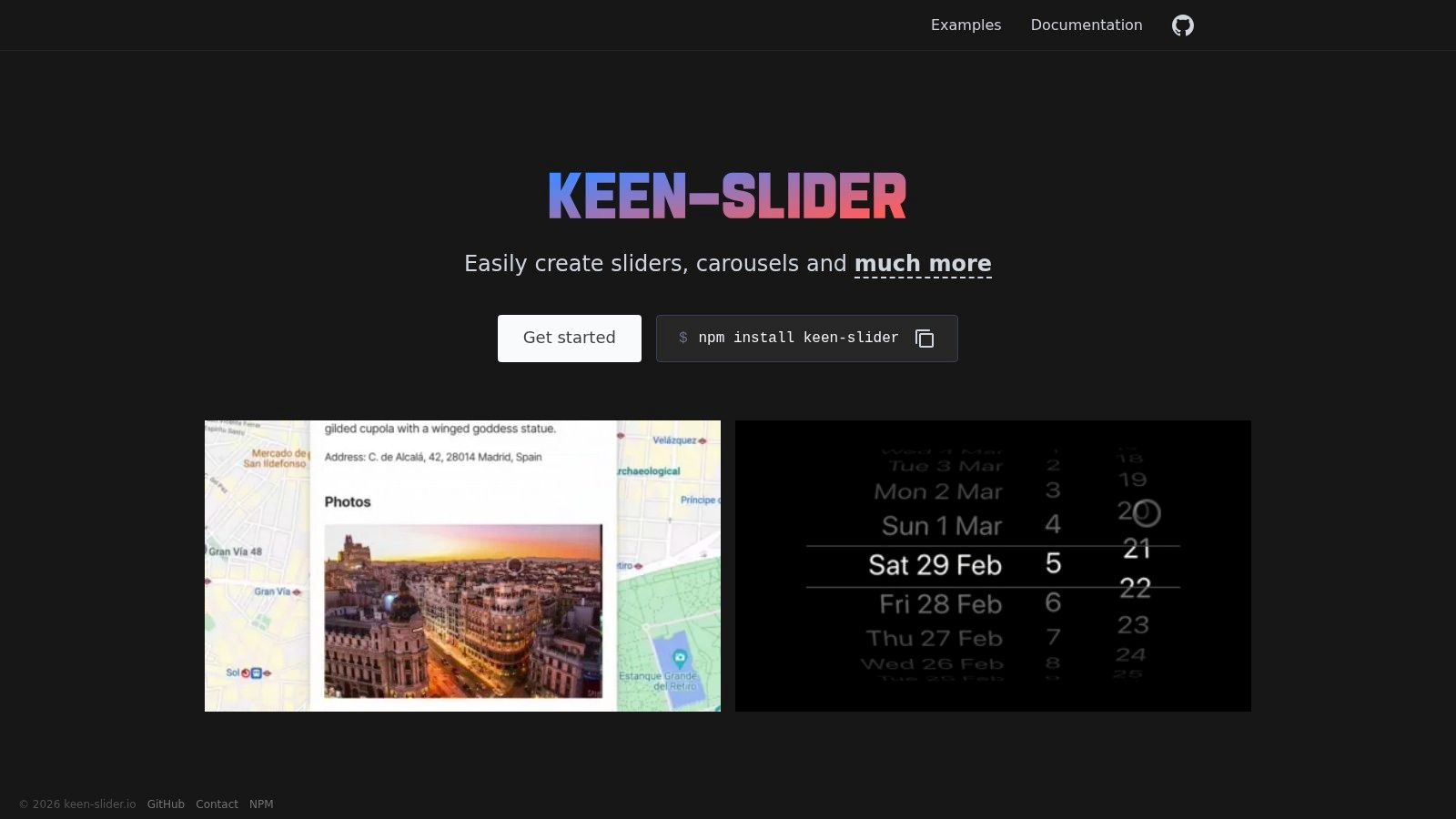
Keen Slider sits in a useful middle ground. It's lightweight, framework-agnostic, and easier to shape than heavier libraries, but it still has enough examples to keep implementation practical. It works with JS and TS and integrates with React, Vue, Angular, and React Native.
Its published footprint is about 5.5 KB gzipped on Keen Slider, which makes it appealing on performance-sensitive pages where a testimonial strip shouldn't cost much.
Where Keen Slider works best
Keen Slider is strong when the content is straightforward but the interaction still needs polish. Think product recommendation rows, mobile-first review cards, or a testimonial band on a landing page where every extra dependency gets questioned.
It's also a good fit when your team wants a near-headless setup without a steep abstraction curve.
- Small footprint: Better for pages that already carry analytics, personalization, and media scripts.
- Clean API: Motion, alignment, and breakpoints are easy to tune.
- Useful example snippets: Teams can copy patterns without inheriting a giant framework.
A large-scale analysis published by Smashing Magazine examined about 7.5 million mobile ecommerce carousel events over 11 months. That doesn't prove any one library is best, but it does reinforce the point that mobile carousel behavior deserves careful tuning. Keen Slider's mobile precision is a meaningful advantage there.
The trade-off is similar to Embla, just a bit softer. You still need to own your UI and styling. If your stakeholders expect built-in fancy effects, Keen Slider won't be the showiest option.
6. Flickity
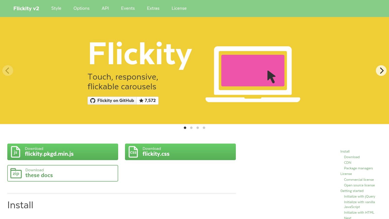
Flickity is the practical pick for teams that want something proven, readable, and commercially straightforward. Its docs are concise, the API is approachable, and the interaction model feels stable rather than experimental.
That matters more than people admit. In many internal projects, the best carousel isn't the one with the most effects. It's the one another developer can maintain six months later without rereading the source.
Why teams still choose Flickity
Flickity handles touch, drag, free scroll, cell alignment, and responsive behavior with little ceremony. It also has a clear licensing path for businesses that need commercial terms, which is one reason it still shows up in production environments.
The licensing model is the key trade-off. Flickity is GPLv3 for open-source use, or you pay for a commercial license. For some teams, that immediately settles the decision. For others, the commercial path is a feature because it removes ambiguity.
Use Flickity when predictability and licensing clarity matter more than ecosystem hype.
This library also fits testimonial layouts that need to look polished but not overdesigned. If you're pairing a slider with short social proof cards, logos, or a simple quote sequence, it gives enough control without becoming a front-end project of its own.
For teams shaping the content before they shape the motion, a testimonial template guide from Bragly can help tighten what goes into each slide. Better content usually matters more than a more elaborate transition.
7. Tiny Slider
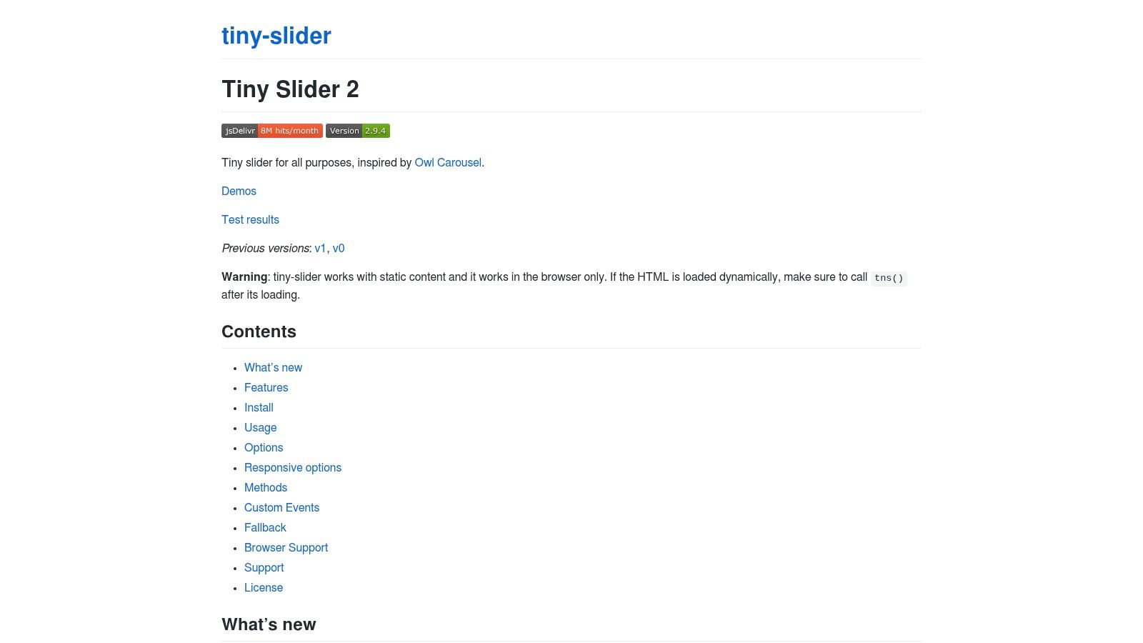
Tiny Slider is the simplest option here. It's dependency-free, MIT-licensed, CDN-friendly, and easy to bootstrap when you need a classic slider without much ceremony.
That makes it a good fit for basic testimonial strips, simple logo or review rows, and low-complexity marketing pages. If your team doesn't need a headless architecture or a giant visual API, Tiny Slider stays out of the way.
Keep expectations realistic
The strongest case for Tiny Slider is speed. You can get a conventional carousel live quickly, and the demos cover autoplay, lazy-load, and responsive breakpoints. For non-specialists, that matters.
Its limitations are also clear. The ecosystem is quieter, the effect set is smaller, and it's more static in spirit than Embla or Keen Slider. That isn't necessarily a flaw. It just means Tiny Slider is best when the carousel itself isn't a strategic differentiator.
There's also a bigger UX warning attached to simple homepage rotation patterns. Historical carousel research reported that carousel links were clicked less than 1% of the time relative to homepage visits, including 0.8% in one period, and over the last 30 days only 0.2% of unique visitors clicked a carousel slide. If you use Tiny Slider for homepage messaging, put the highest-priority content first and assume later slides may get very little attention.
For narrow testimonial strips, product cards, or lightweight galleries, Tiny Slider still earns its place.
Top 7 Website Carousel Libraries Compared
| Tool | Implementation complexity | Resource requirements | Expected outcomes | Ideal use cases | Key advantages |
|---|---|---|---|---|---|
| Bragly | Very low, no-code, one-line embed | Minimal dev; subscription tiers (Free/Pro/Business) and AI/collection quotas | Centralized, auto-syncing review widgets and summarized insights | Small businesses, e‑commerce, SaaS teams, agencies wanting fast social proof | Aggregates 50+ sources, branded widgets, built‑in AI, moderation & analytics |
| Swiper | Moderate, feature-rich with many options | Dev integration for chosen framework; core MIT free, Swiper Studio paid | Highly configurable, polished sliders with many visual effects | Marketing pages, product galleries, testimonial carousels at scale | Mature ecosystem, extensive demos, broad integrations (React/Vue/Web) |
| Splide | Low to moderate, lightweight with clear patterns | Small footprint; minimal dependencies; adapters for frameworks | Accessible, performant sliders with common carousel patterns | Accessible testimonial sliders, galleries, CMS pages | Focus on accessibility (a11y/i18n/ARIA), examples and framework adapters |
| Embla Carousel | Higher, headless API requires custom UI | Dev effort for markup/styling; lightweight runtime and plugin system | Precise, smooth motion and full control over UI and behavior | Design systems, custom UI kits, projects needing bespoke controls | Headless control, SSR-friendly, fine‑grained touch/drag precision |
| Keen Slider | Moderate, clean API, headless-leaning | Very small bundle (~5.5 KB gzipped); dev work for UI | Fast, mobile‑precise sliders with easy motion tweaks | Performance‑sensitive pages, product showcases, mobile-first sites | Minimal footprint, easy to customize motion, many example snippets |
| Flickity | Low, concise API, polished defaults | Low dev effort; GPLv3 or paid commercial license for closed-source use | Stable, predictable carousels with minimal setup | Production sites needing reliable behavior and commercial licensing | Production-proven stability, clear commercial licensing path |
| Tiny Slider | Very low, simple API, CDN-friendly | Minimal dev; works from CDN/HTML for static sites | Basic, lightweight testimonial/product strips quickly bootstrapped | Simple static pages, quick prototypes, basic testimonial sections | Compact, easy to implement, MIT-licensed and CDN-friendly |
Turn Inspiration Into a Better Carousel
The useful lesson from these website carousel examples isn't that one library wins. It's that the right carousel starts with content intent. A testimonial carousel on a pricing page has a different job than a product gallery on a PDP or a rotating banner on a homepage.
That's why the selection process should stay practical. Match the component to the content goal. Keep controls visible. Support keyboard input and assistive technology. Avoid forcing autoplay unless there's a clear reason and users can pause it. Optimize images and motion. Test the pattern on narrow screens before calling it done. Measure engagement after launch instead of assuming movement improves conversion.
The evidence behind that caution is strong. A usability study comparing an ecommerce site with and without a carousel found that the version without a carousel performed better, and participants strongly preferred it. Nielsen Norman Group also notes that some auto-forwarding carousels rotate every 5 seconds, which tends to make control worse, not better. Yale's usability guidance is similarly blunt. It says carousels are typically ignored, do not engage users, and frustrate users.
Accessibility isn't optional in that decision. The W3C carousel tutorial stresses semantic structure, stop and resume controls, and communication of slide changes to assistive technology. A technically functional slider still fails if mobile users can't operate it, motion-sensitive users can't stop it, or screen-reader users can't understand where they are.
Key takeaways are simple. Swiper is the broadest option when you need feature depth and framework support. Splide is a strong pick when accessibility guidance matters. Embla and Keen Slider are excellent for custom, lightweight builds. Flickity works well when licensing clarity and predictable behavior matter. Tiny Slider suits simple strips that need fast implementation. Bragly is the better choice when the job is aggregating, curating, syncing, and publishing reviews without turning social proof into another maintenance task.
If your team needs more than a slider, Bragly gives you a practical way to collect reviews, pull in third-party proof, curate testimonials, and publish them in carousel, grid, badge, and other no-code layouts. It fits this problem well because it helps you decide how testimonials should appear, not just how they should move.