

Looking for a Shorter Overview?
AI Summary
Key Moments
Treat testimonials as verifiable evidence
Always display source, date, rating context, and objections answered to build credibility.Choose testimonial layouts by page role
Match formats like grids, carousels, or badges to the layout’s purpose and visitor needs.Place testimonials near decision points
Position proof close to actions like pricing, signup, and product pages for maximum impact.Maintain legal and editorial integrity
Follow FTC rules and avoid fake reviews, curate for relevance, and show balanced feedback.Stop designing testimonials website design as a trophy case. The popular advice says to gather your happiest quotes, add headshots, put them in a moving carousel, and watch trust rise. That advice creates the exact problem it claims to solve. A visitor who can't compare reviews, check dates, or see where praise came from has no reason to believe any of it.
Good testimonials website design treats every quote as verifiable evidence. Source, date, rating context, and the objection it answers stay visible. A few critical comments stay visible too. That takes more discipline than picking your favorite lines, and it's why most testimonial sections look polished and persuade nobody.
Choose a Testimonial Layout for the Job
A moving wall of five star quotes is usually the weakest option you can ship. Visitors can't compare evidence while it slides past, perfect scores look curated, and the one review that answers their objection may be hidden behind three clicks. Pick one primary layout per page region, based on the decision that region supports, and make every other format secondary to it.


Testimonial layouts by page job
| Layout | Best placement | Visible at once | Main risk | Choose it when |
|---|---|---|---|---|
| Single review | Beside one claim or pricing tier | 1 quote | Feels anecdotal | You need proof for a specific objection |
| Carousel or slider | Narrow band under a hero or logo row | 1 to 3, rest hidden | Hidden quotes and motion fatigue | Space is tight and controls expose every item |
| Grid | Pricing, product, or service page | About 6 to 9 cards | Can look repetitive if cards are identical | Visitors need to scan and compare |
| Mosaic | Mixed text and video section | Uneven card sizes | Harder to align on small screens | Stories vary a lot in length and media |
| Badge | Header, footer, or checkout reassurance | Score and count only | No story or context | You already link to a fuller review set |
| Marquee or ribbon | Thin strip of names or short lines | A scrolling sample | Easy to ignore and hard to read | You want ambient proof, not the decision point |
| Full testimonial page | Nav item or linked wall | Dozens, with filters | Overwhelming without search and tags | Volume is high and use cases differ |
Why Perfect Scores Undermine Layouts
Northwestern's Spiegel Research Center analysis of online reviews reported that a product with five reviews had a purchase likelihood 270% higher than a product with no reviews. Displaying reviews increased conversion by 190% for lower-priced products and 380% for higher-priced products, while purchase likelihood generally peaked between 4.0 and 4.7 stars before declining as ratings approached 5.0.
Read that as a design constraint, not a permission slip to chase stars. A layout that can only display flawless praise is built to fail, because it can't show the mixed feedback visitors find credible. Show the review count next to the average on every summary. A five star badge built on three reviews reads as curated, since shoppers doubt high scores when the count behind them is low.
Carousels deserve special suspicion. They're acceptable in a narrow band when every item is reachable without hunting, controls are obvious, and nothing essential exists only offscreen. If you're evaluating that route, pair it with a static alternative and review the mechanics in this guide to building a testimonial slider in HTML before committing. Grids win on pricing and product pages because six to nine cards let people scan for their situation. Mosaics earn their complexity only when stories vary in length and media. Badges and marquees are reminders, never the only proof on a page.
Default pairing: Put a compact proof row on the homepage and link it to a filterable wall. The row reassures quickly. The wall lets skeptics verify.
That pairing covers both visitor types without duplicating your maintenance burden. The homepage row shows average, count, and two or three attributed lines. The full page carries search, filters, and sort for people who investigate. I'd start there before adding any decorative format.
Place Proof Where Decisions Happen
Testimonials buried at the bottom of a page do decorative work. Testimonials placed within one screen of a commitment do decision work. Apply these five placements to an existing site in order, and attach one measurement to each so you know whether the placement earns its space.
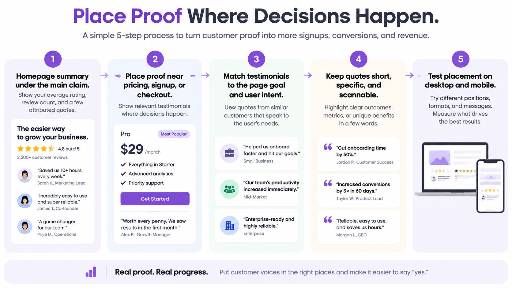
The Five Placements
- Homepage summary: Put average rating, review count, and two or three attributed lines under your main claim, with a link to the full set. Don't put a full wall in the hero. Measure click through to the full page.
- Pricing and signup: Place two to four testimonials within one screen of the button, each tied to an outcome a buyer of that tier would recognize. A quote about onboarding speed doesn't help someone worried about per seat cost. Measure conversion on that tier.
- Product and service pages: Treat reviews as primary information, above long specifications on mobile. People often learn fit from other customers instead of description copy. Measure time in the review block and add to cart rate.
- Dedicated testimonial page: Add it to the nav or footer and link every summary to it. If you're also working on offline and local channels, it's worth learning to build a local social proof strategy so the page draws on reviews you're already earning elsewhere. Measure filter use and assisted conversions.
- Case studies: Keep long stories on case study pages. Pull only a short, sourced excerpt into marketing sections and link back. Measure excerpt clicks, not impressions.
Verify Externally and Test Honestly
Baymard's large-scale usability research found that up to 95% of users rely on reviews when evaluating products, and its direct-to-consumer testing found users remain skeptical of reviews hosted solely on the brand's own site. Aggregate recognizable third party sources, preserve source attribution, rating, date, and product context, and offer a path to inspect the full set. Don't import only glowing lines.
Test a first party only block against a mixed source block and split results by new versus returning visitors. New visitors from unfamiliar traffic sources need external verification most, so a blended average hides the effect. This breakdown of how social proof affects conversion helps you decide which metrics matter beyond widget views.
Visual consistency is part of placement, not polish. Stanford's Web Credibility Project guidelines stress making information easy to verify and designing so the site looks professional for its purpose. Consistent cards, readable type, real names where you have permission, and contact details nearby make the same quotes feel checkable. Sketch this page map on paper before you touch code. You'll catch orphaned proof faster than any design tool will.
Curate Testimonials Without Hiding the Truth
Placement decides whether visitors see your testimonials. Provenance decides whether they believe them. A 2025 European consumer report from BEUC found that 66% of surveyed consumers had encountered fake reviews, while 93% read online reviews before purchasing. Warnings alone don't fix this, since people keep treating fabricated reviews as genuine. Volume and polish aren't proof.
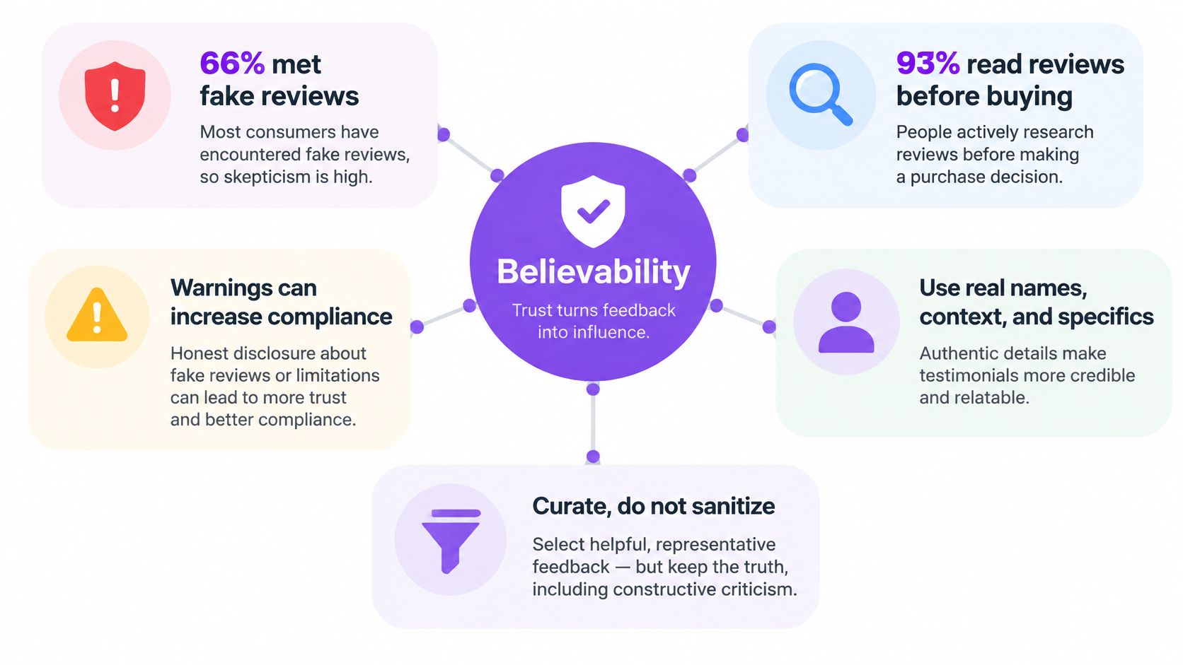
What belongs on a believable testimonial card
| Field | What it proves | Minimum to publish |
|---|---|---|
| Name and role or company | A real customer, not an anonymous slogan | First name plus role, or company, with consent |
| Date | Freshness | Month and year visible on the card |
| Source | Independent or first party origin | Platform name or a clear first party label |
| Rating and count | The score is not a lone five stars | Stars plus the average and how many reviews sit behind it |
| Use case or product | Relevance to this visitor | The offer, plan, or job the review is about |
| Photo or logo | Recognition, not proof by itself | Optional; never the only signal of identity |
| Response to criticism | You do not hide problems | Show a real critical review and the reply on the full page |
Say in plain site copy whether items are imported, requested, lightly edited for length, or summarized. Keep the short original available behind any summary. If you're building your collection process from scratch, this walkthrough to build social proof with AdCrafty covers asking customers in ways that produce specific, usable answers. A structured customer testimonial template also helps, because requested testimonials without prompts produce vague praise nobody trusts.
The Legal Floor and the Editorial Habit
The U.S. Federal Trade Commission's Consumer Reviews and Testimonials Rule questions and answers took effect on October 21, 2024. It prohibits creating, selling, or purchasing fake reviews, buying reviews conditioned on positive or negative sentiment, suppressing reviews, and using insider testimonials without clearly disclosing their relationships. A company controlled review website also can't falsely present itself as independent.
Build your workflow around those limits. Get permission before using names, photos, and logos. Approve submissions in one queue, tag them by use case, customer type, language, and product, then publish. Retire undated or very old lines, or label the date clearly when an older story is still your clearest example.
Curate for relevance, not for sentiment. If every filtered view shows only praise, you've built a brochure with a search box.
Show a few critical notes with your response instead of a flawless grid. Keep a balanced sentiment mix in each filtered view so visitors see how you handle the objection they actually have. Use an AI summary only as a scannable layer above the originals, never as a substitute that hides wording you wouldn't stand behind.
Keep Testimonials Readable on Every Device
Mobile layout and accessibility are design constraints, not a polish pass at the end. Most testimonial blocks fail on phones first, because they were designed as wide desktop grids and shrunk. Start with the small screen and the keyboard, and the desktop version mostly takes care of itself.

The Non Negotiable Specs
- Stack below about 640 pixels: Use one column of cards, keep body text at least 16 pixels, and don't let card padding eat the quote.
- Make controls tappable: Next, previous, and filter controls need at least 44 pixels with visible text labels, not icon only buttons people have to guess at.
- Put rating and reviewer in text: A star image without a text alternative fails anyone who can't see the graphic. Write the rating out.
- Hold 4.5 to 1 contrast: Light gray quotes on white cards look elegant in a mockup and disappear in sunlight.
Don't autoplay carousels by default. If motion is on, provide pause, respect reduced motion settings, and keep every testimonial reachable by keyboard with a visible focus ring. A Wharton research study on purchased reviews found consumers were especially suspicious of products with high ratings when they had relatively few reviews. A motion heavy slider that hides the count and crops names works directly against that skepticism, because it presents changing evidence nobody can pause and inspect.
Prefer a grid or list on small screens. If you keep a slider, add a text link to view all testimonials so nobody has to swipe through a sequence to find a relevant one. Give the block a proper heading so screen reader users can jump to it, and never trap focus inside a review modal. Lazy load images below the fold, but don't lazy load the first visible quotes. Delayed text makes the section feel broken, and visitors won't wait around to find out otherwise.
Three Checks in One Sitting
Run these before you ship. First, open the page on one real phone, not an emulator, and read every testimonial without zooming. Second, tab through the entire block with a keyboard only and confirm you can reach, read, and exit everything. Third, zoom to 200 percent and check that cards reflow instead of clipping names and dates.
Fix failures in this order. An autoplaying carousel that crops attribution and hides the rest of the set goes first, because it breaks reading, comparison, and verification at once. Contrast and tap target problems come next. Decorative spacing tweaks can wait until those pass.
Embed Testimonials on Popular Site Builders
Embedding goes wrong when you paste first and organize later. Static text pasted into five pages becomes five places to update, and it drifts out of sync within a month. Follow this builder agnostic sequence, then use the exact component your platform expects.
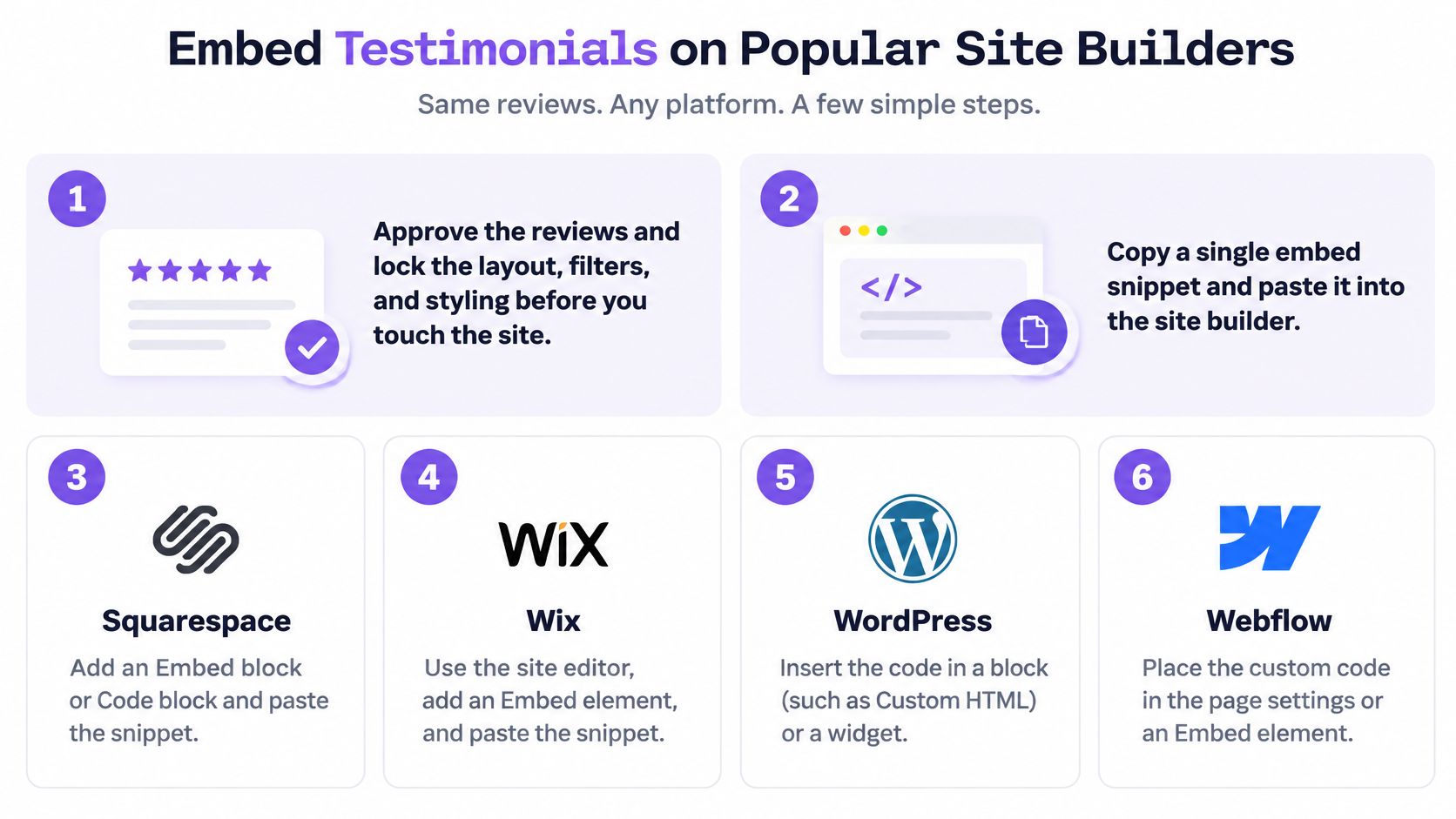
The Eight Step Sequence
- Approve before you build: Lock the approved reviews, layout, filters, and styling before you touch the site. Embedding an unfinished set invites last minute cherry picking.
- Copy one snippet: Use a single embed snippet rather than pasting reviews as static text you'll edit by hand forever.
- WordPress: Add a Custom HTML block or an HTML widget in the theme area. Avoid the visual editor if it strips scripts, and confirm the block survives a theme update.
- Webflow: Drop an Embed element into the section, paste the snippet, and publish. The designer canvas often won't run it, so an empty preview doesn't mean failure.
- Wix: Use the HTML embed component in that section and check the mobile editor separately. Desktop width hides overflow that breaks the phone layout.
- Shopify: Place the snippet in a custom liquid section or a page's HTML area. Don't bury product reviews only on the homepage when the product page is where people decide.
- Custom site: Paste the snippet where HTML is allowed and load it after the main content if the script is heavy. Testimonials should never block the offer itself from rendering.
- Recheck the live URL: Confirm cards stack, controls work, a consent banner doesn't cover them, and the summary links to the full set.
Embed components by site builder
| Builder | Component to use | Check before publishing |
|---|---|---|
| WordPress | Custom HTML block or HTML widget | Confirm the block survives a theme update |
| Webflow | Embed element in the section | Publish, because the designer canvas often will not run the script |
| Wix | HTML embed component in the section | Check the mobile editor separately |
| Shopify | Custom liquid section or page HTML area | Place it on the product page, not only the homepage |
| Custom site | Any location where HTML is allowed | Load after main content if the script is heavy |
Sync from connected sources beats monthly screenshot updates every time. Screenshots can't be filtered, searched, read by screen readers, or refreshed when a reviewer edits their words. They also freeze your dates, which makes a living business look dormant.
The Ten Minute Publish Checklist
Before you call it done, verify four things on the live page. The source label is visible on every card. The date is visible without expanding anything. The block scrolls cleanly on mobile with no horizontal drift. A keyboard user can tab through the block and land on the link to the full review set. If any one fails, fix it now. These are the details visitors use to judge whether your proof is real.
Launch a Testimonial Page You Can Maintain
Ship one proof row and one dedicated testimonial page this week, using the layout you've already chosen, with dates, sources, and at least one non perfect review visible. Don't wait for a perfect library. A small, honest set you can update beats a large static one that goes stale by next quarter.
The workable stack has three parts. First, a request form you can share after a project. Creating a testimonial form takes less than 60 seconds, so there's no reason to keep asking over email threads. Second, a queue where each submission is approved and tagged before it goes live. Third, a single line of HTML that places the styled widget beside your main call to action.
Your Launch Checklist
- Compact row live: It shows the count, the average, and a link to the full set.
- One wall live: The Wall of Love is a fully branded reviews page that can be shared as a standalone link or linked from an existing site, so your marketing pages stay light.
- Filters later: Add them only after the first set of real testimonials is published and tagged.
More than one wall makes sense when audiences differ, such as product users versus service clients. Start with one anyway. You can split it once volume forces the issue, and you'll learn your tagging scheme on a manageable set instead of a backlog. Hosted tools can handle collection, approval, styling, and embedding without a custom build, but this same checklist applies to any setup you choose.
Ready to replace your static quote blocks with proof visitors can verify? With Bragly you can collect testimonials through shareable forms, approve and tag them in one dashboard, and embed styled widgets or a branded Wall of Love page with a single line of HTML. Start free today and ship your first proof row this week, dates, sources, and honest reviews included.