
Looking for a Shorter Overview?
AI Summary
Key Moments
Targeted placement matters most
Place social proof right next to buyer objections to maximize impact at decision points.Specific proof beats generic praise
Buyers trust proof that details real outcomes, roles, or use cases over vague compliments.Initial reviews are the most impactful
Gaining a credible first cluster of reviews greatly lifts conversion especially on high-intent pages.Keep social proof fresh and curated
Continually remove outdated or irrelevant proof to maintain trust and relevance on key pages.You're probably in this situation right now.
You have a page that should convert. The product is solid. The pricing is fair. The design looks clean. But buyers still pause at the last second, scroll around, and leave without taking action.
Then you look at a competitor or even just another listing in the same category. It isn't always cheaper. It isn't always better written. It just feels safer. There are reviews near the buy button. A customer quote answers the exact objection you had. A familiar logo shows up right before the trial form. The page gives you one quiet message: other people already trusted this.


That's why social proof conversion matters. It's not decoration. It's not a nice extra for the homepage. It's a tool for reducing uncertainty at the moment a buyer hesitates.
Some teams get this partly right and still miss the sale. They collect testimonials, add a ratings badge, maybe build a wall of praise on one page, and assume the job is done. But more proof doesn't automatically mean more conversion. Generic proof often gets ignored. Outdated proof can create doubt. Proof placed too far from the decision point shows up after the buyer needed reassurance.
The useful question isn't “How much social proof can we add?” It's “What proof belongs on this page, for this buyer, at this moment?”
That shift changes everything. It moves the conversation from volume to placement, from praise to specificity, and from dumping reviews onto a page to using them with intent.
Introduction Why Social Proof Decides the Final Click
A shopper compares two similar coffee grinders online. One page has polished copy and a clean layout, but no customer feedback in sight. The other has a star rating beside the product title, a few recent reviews under the price, and a short testimonial that mentions noise level and grind consistency.
Knowing which page feels easier to trust is often intuitive.
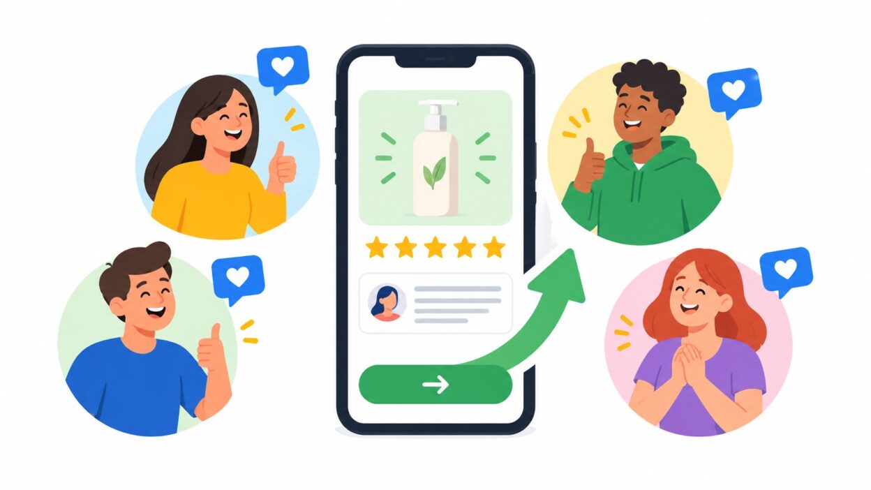
The second page wins because it answers the silent question running through almost every purchase: Will this work for someone like me? Social proof helps buyers borrow confidence from other customers when they don't have enough of their own yet.
The hesitation gap
Conversion usually doesn't fail because people hate the offer. It fails because they're unsure.
On a product page, that uncertainty sounds like this:
- Quality doubt: Is this as good as the photos make it look?
- Fit doubt: Will this work for my situation?
- Risk doubt: What happens if I regret it?
- Price doubt: Is this worth paying more for?
Social proof works when it closes one of those gaps at the exact place where the doubt appears.
A five-star badge at the bottom of a long page might not help someone who's hesitating next to the add-to-cart button. A vague testimonial like “Great service, highly recommend” won't calm a pricing objection. But a quote that says “We switched in one afternoon and our support team could use it without training” can do real work on a software signup page.
What makes social proof useful
Not all praise is persuasive.
Buyers respond to proof that feels specific, current, and close to the decision. They ignore proof that feels staged, recycled, or detached from what they're deciding.
Social proof earns the click when it removes uncertainty, not when it simply adds positivity.
That's the frame to keep in mind through the rest of this guide. Social proof conversion isn't mainly a collection problem. It's a matching problem. You need the right signal, in the right place, for the right concern.
How Social Proof Influences Buying Decisions
People use social proof the same way they use a busy restaurant as a shortcut. If the food is unfamiliar and two places look similar, a full dining room becomes a signal. It doesn't prove the meal will be perfect. It reduces the odds that you're making a bad choice.
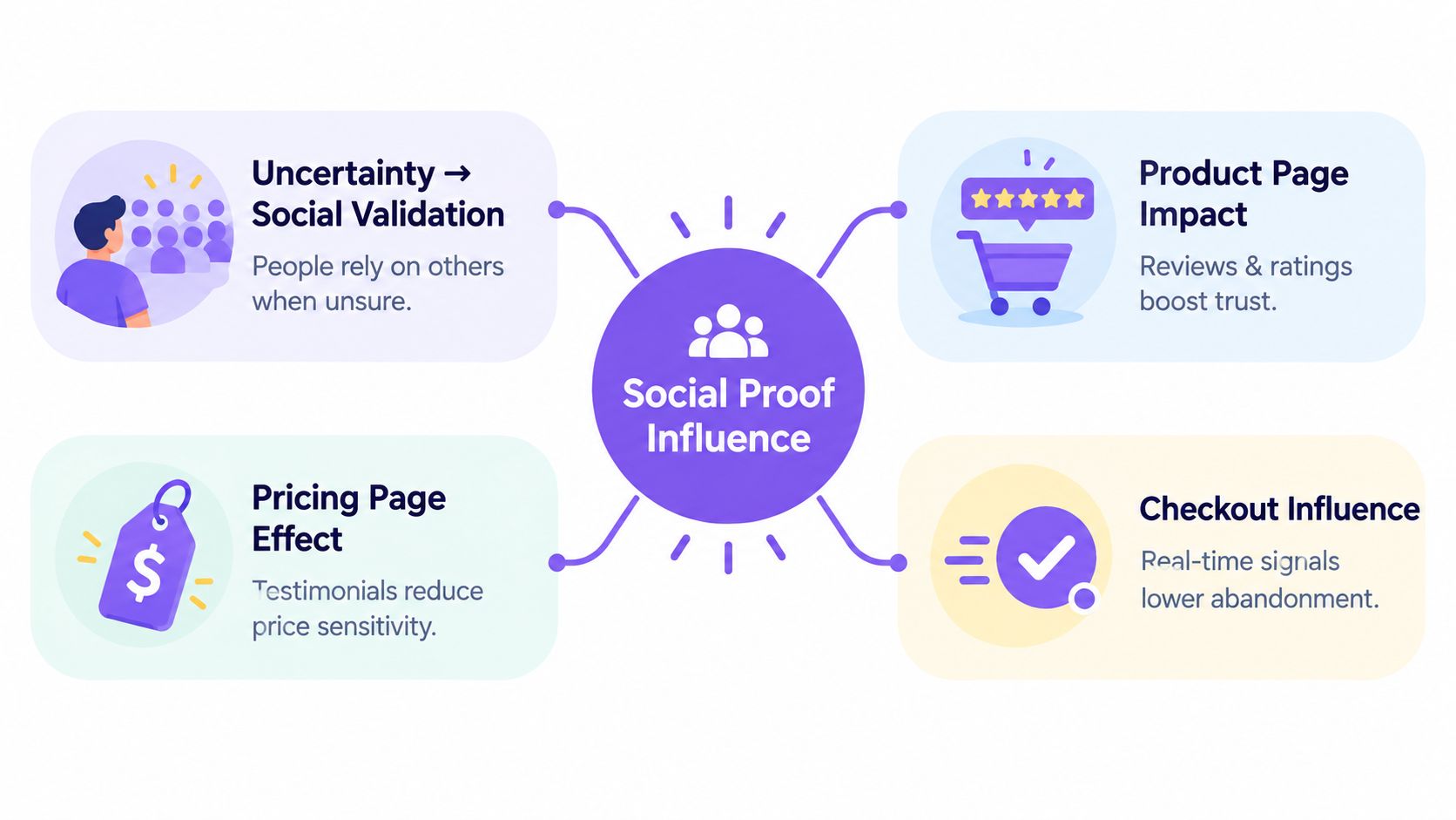
Online buying works the same way, except the room is invisible. Reviews, ratings, testimonials, badges, and customer logos stand in for the crowd.
Buyers borrow confidence from other buyers
Most visitors don't arrive ready to believe your claims on their own. They need confirmation from someone outside the brand.
That confirmation can take different forms:
- Ratings help with fast trust. They answer, “Is this broadly liked?”
- Written reviews help with practical trust. They answer, “What happens after I buy?”
- Testimonials help with identity fit. They answer, “Did someone like me succeed with this?”
- Logos and badges help with legitimacy. They answer, “Is this a real, credible business?”
Each format transfers trust in a different way. That's why the same proof can work on one page and flop on another.
Decision points matter more than page ownership
A common mistake is treating social proof like a content asset that belongs on the homepage. In practice, it belongs where buyers get nervous.
On a product page, buyers often worry about quality and fit. On a pricing page, they worry about value and risk. At checkout, they worry about commitment, returns, or whether the company is trustworthy enough to hand over payment details.
Practical rule: Put proof where the objection appears, not where marketing space is available.
This is why proximity matters so much. A testimonial near a CTA can reassure someone while they're deciding. The same quote buried far below the fold may be technically present but functionally invisible.
Authenticity beats polish
Buyers have become skilled at spotting proof that feels too smooth.
A generic quote with no role, no context, and no detail doesn't reduce uncertainty. It often creates a new kind of uncertainty: was this written by a real customer at all?
The strongest proof usually has texture. It mentions the problem, the use case, and the result in plain language. It sounds like someone describing a real experience, not a marketing team sanding down every edge.
That's also why freshness matters. A review from years ago can still be positive but feel irrelevant. Buyers want signs that people trust you now, not just that they did at some point in the past.
What Research Says About Reviews and Conversion Lift
The numbers that matter most in social proof conversion don't tell a simple “more is better” story. They point to something more useful. Conversion lift is often threshold-driven.
Northwestern University's Spiegel Research Center found that products with five reviews had a 270% greater purchase likelihood than products with no reviews, and higher-priced products saw an even larger 380% lift according to its online review research and related summary pages in the Spiegel Research Center review findings.
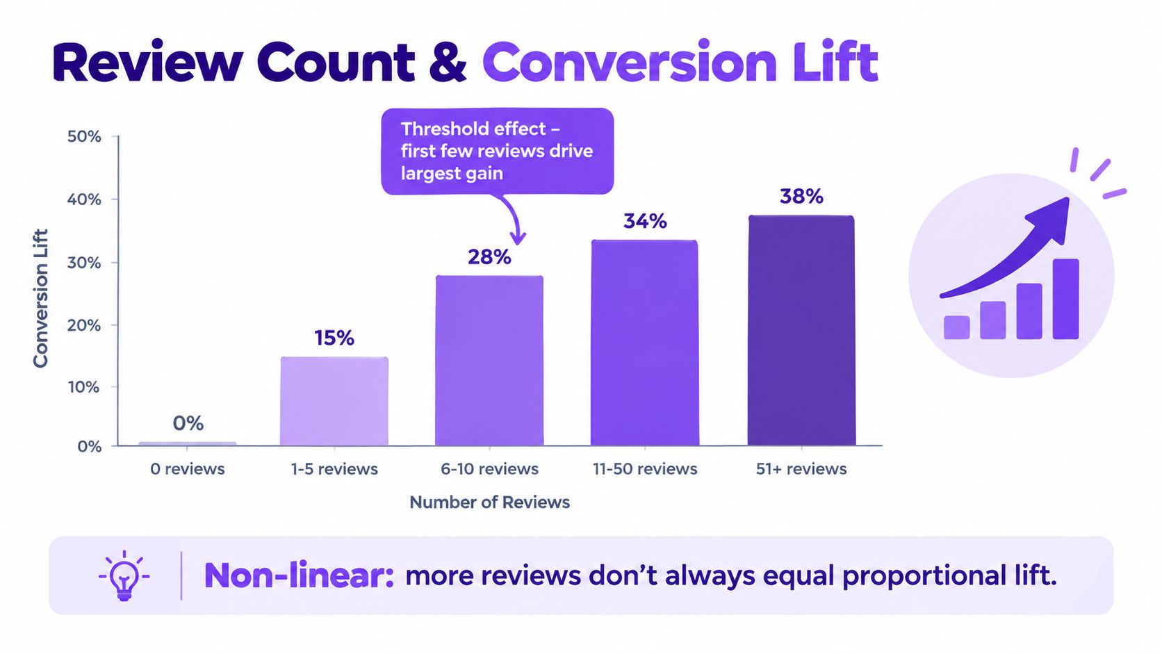
That finding matters because it changes how you should prioritize review collection. If you have limited time, you don't need to spread effort evenly across every SKU, plan, or landing page. You want to get a credible first cluster of reviews onto the pages where hesitation is expensive.
The first reviews carry unusual weight
A product with no reviews feels untested. A product with a handful of real reviews feels considered.
That doesn't mean volume stops mattering after five reviews. It means the jump from zero to a few visible reviews often does more persuasive work than the jump from many to even more. Early proof lowers uncertainty fast.
For teams, this usually suggests a better rollout order:
- Start with high-intent pages where buyers are already close to action.
- Prioritize higher-priced offers because visible proof appears to matter even more there.
- Build depth on a smaller set of important pages before trying to cover everything.
A short explainer can help if you want another view on the topic:
Ratings influence conversion too
Review presence is one layer. Star rating quality is another.
SOCi's analysis of Google Reviews reported that a one-star improvement such as moving from 3.0 to 4.0 stars corresponded to a 44% increase in conversions, while each 0.1-star increase was associated with roughly a 4.4% conversion gain in the SOCi Google Reviews analysis.
That's useful because it reminds teams that social proof isn't just a display project. It's also an operations project. Better customer experience, better review response habits, and better reputation management can affect conversion before anyone changes the page layout.
More proof isn't always better proof
The strongest practical lesson from the research is restraint.
A recent review of findings noted that visitors exposed to pages with at least one review were 52.2% more likely to convert than visitors seeing none, and active interaction with ratings and reviews could lift conversion by 120.3%, while academic work also pointed to context-dependent limits and even an inverted U-shape in some settings in the review interaction and conversion analysis on ScienceDirect.
The goal isn't to flood a page with proof. It's to surface enough relevant proof that a buyer can stop worrying and move forward.
That's the difference between social proof that helps and social proof that becomes wallpaper.
Choosing the Right Social Proof Format for Your Goal
Once you stop treating social proof as one thing, the format decision gets easier. Different proof types solve different trust problems.
A star rating can settle quick credibility questions. A detailed testimonial can answer “Will this work for my situation?” A logo strip can reassure an enterprise buyer that your company is legitimate. A short badge about secure checkout can calm a late-stage payment concern faster than a paragraph ever could.
Match the format to the trust job
The easiest way to choose is to ask what kind of reassurance the visitor needs on that page.
| Social Proof Format Compared by Trust Job and Best Use | Primary Trust Signal | Best Funnel Stage | Watch Out |
|---|---|---|---|
| Star ratings | Broad approval | Product discovery and product pages | Weak if ratings appear without review context |
| Text testimonials | Specific outcomes and use cases | Pricing pages, service pages, signup pages | Generic praise gets ignored |
| Video testimonials | Human credibility and nuance | High-consideration offers | Can feel heavy if placed too early |
| Client logos | Brand legitimacy | Homepage, sales pages, enterprise pages | Logo walls can become background noise |
| Trust badges | Safety and process confidence | Checkout, forms, payment steps | Too many badges can look defensive |
| Live activity signals | Momentum and recency | Fast-moving ecommerce moments | Must stay believable and relevant |
Specificity changes how hard proof works
The biggest format mistake isn't choosing text over video or logos over ratings. It's showing proof that says too little.
Recent benchmark-style coverage argues that specific testimonials with named customers, titles, and quantified outcomes can convert 3-4x better than generic testimonials, and that personalized logos can outperform a plain logo strip by a large margin in the social proof conversion optimization benchmarks.
That lines up with what teams see in practice. Buyers don't just want positivity. They want context. Who said this? What were they trying to do? What problem did the product solve?
If you want inspiration for how teams phrase and test that kind of message, these A/B test social proof examples are useful because they focus on wording and presentation, not just design trends.
A simple selection guide
Use these cues when you're deciding what to place on a page:
- For low-priced, quick decisions: ratings and short review snippets usually do more work than long stories.
- For expensive or complex offers: testimonials with role, industry, and implementation detail tend to matter more.
- For B2B credibility: logos, named customers, and role-specific quotes usually beat anonymous praise.
- For late funnel reassurance: badges, review excerpts about support, and proof near the form often help most.
If you need a starting structure for collecting stronger customer quotes, this testimonial template guide is a practical way to avoid vague review requests that produce vague proof.
Where to Place Social Proof to Maximize Conversion
A visitor lands on your pricing page, pauses over the CTA, then scrolls without clicking. The problem often is not that you lack testimonials. The problem is that the right proof showed up too late, or answered the wrong question.
Placement is the difference between proof that helps and proof that decorates.
Put proof next to the moment of doubt
Social proof works like a salesperson answering one objection at the exact second it appears. If the answer comes five minutes later, it has less value.
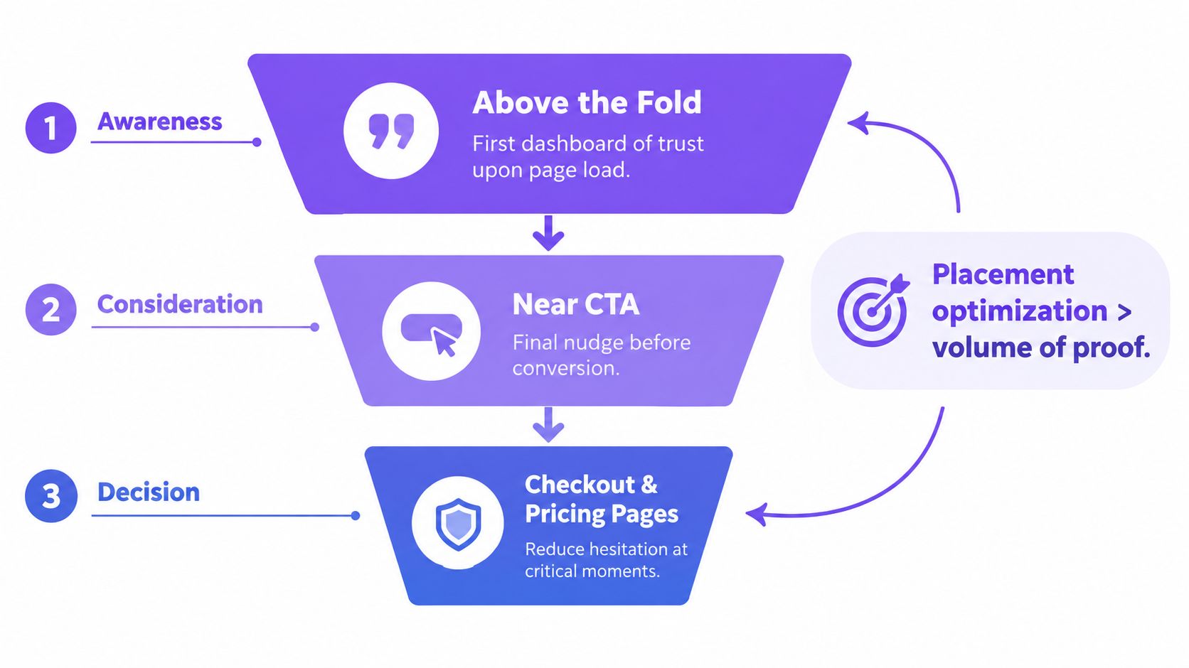
Analysts in these landing page social proof placement benchmarks reported stronger conversion rates when proof moved closer to the primary decision point, including cases where above-the-fold testimonial placement and proof directly under the main CTA outperformed lower-page placement.
That does not mean every page needs a testimonial at the top. It means placement changes performance. The same quote can feel persuasive beside a form and irrelevant buried under three sections of copy.
Placement by page type
Different pages trigger different forms of hesitation. Match the proof to that hesitation.
Product pages
Place star ratings or review counts near the product title, price, or variant selector. Buyers are asking basic questions here. Is this popular? Does it match the description? Is the quality consistent?
Then place one or two short review snippets near the add-to-cart area. A long testimonial halfway down the page asks for too much attention. A short quote about fit, durability, or ease of use helps at the exact decision point.
Pricing pages
Pricing pages create comparison stress. Buyers want to know whether the cost is justified and whether setup will be painful.
Put proof near the plan table or primary CTA. The best fit here is usually a quote about value, ROI, onboarding speed, or support quality. A generic compliment such as “great product” does very little on a page where the question is “why this plan at this price?”
Checkout and forms
At this stage, visitors are not looking for broad brand credibility. They want confirmation that payment, signup, or contact will go smoothly.
Keep proof short and close to the form. A review line about responsive support, accurate delivery, or an easy return process usually does more work here than a carousel of success stories.
One strong sentence can be enough.
Generic proof can backfire
More proof is not always better. Irrelevant proof can act like background noise.
A homepage quote from a happy customer may help near the top of the funnel, but it can fall flat on a demo form if it does not address security, implementation, or results. Old reviews have a similar problem. Visitors notice stale dates, vague praise, and overpolished wording faster than many teams expect.
Use a simple placement test before adding any proof block:
- What concern is the visitor likely to have at this point?
- Does this proof answer that concern directly?
- Is it specific enough to sound real?
- Will the visitor see it before clicking away or stalling?
Mobile raises the stakes. Screen depth is limited, and hesitation happens faster. If the proof sits far below the CTA, many visitors will never see it.
The practical rule is simple. Put specific proof where friction appears. Generic proof placed far from the decision point does not just underperform. It can make the page feel less credible.
Keeping Social Proof Fresh Relevant and Measurable
The hardest part of social proof conversion isn't adding the first widget. It's keeping the proof useful after launch.
Reviews get old. Product lines change. The best testimonial for one audience can be the wrong one for another. If no one curates what's shown, social proof turns into a stale archive instead of a conversion tool.
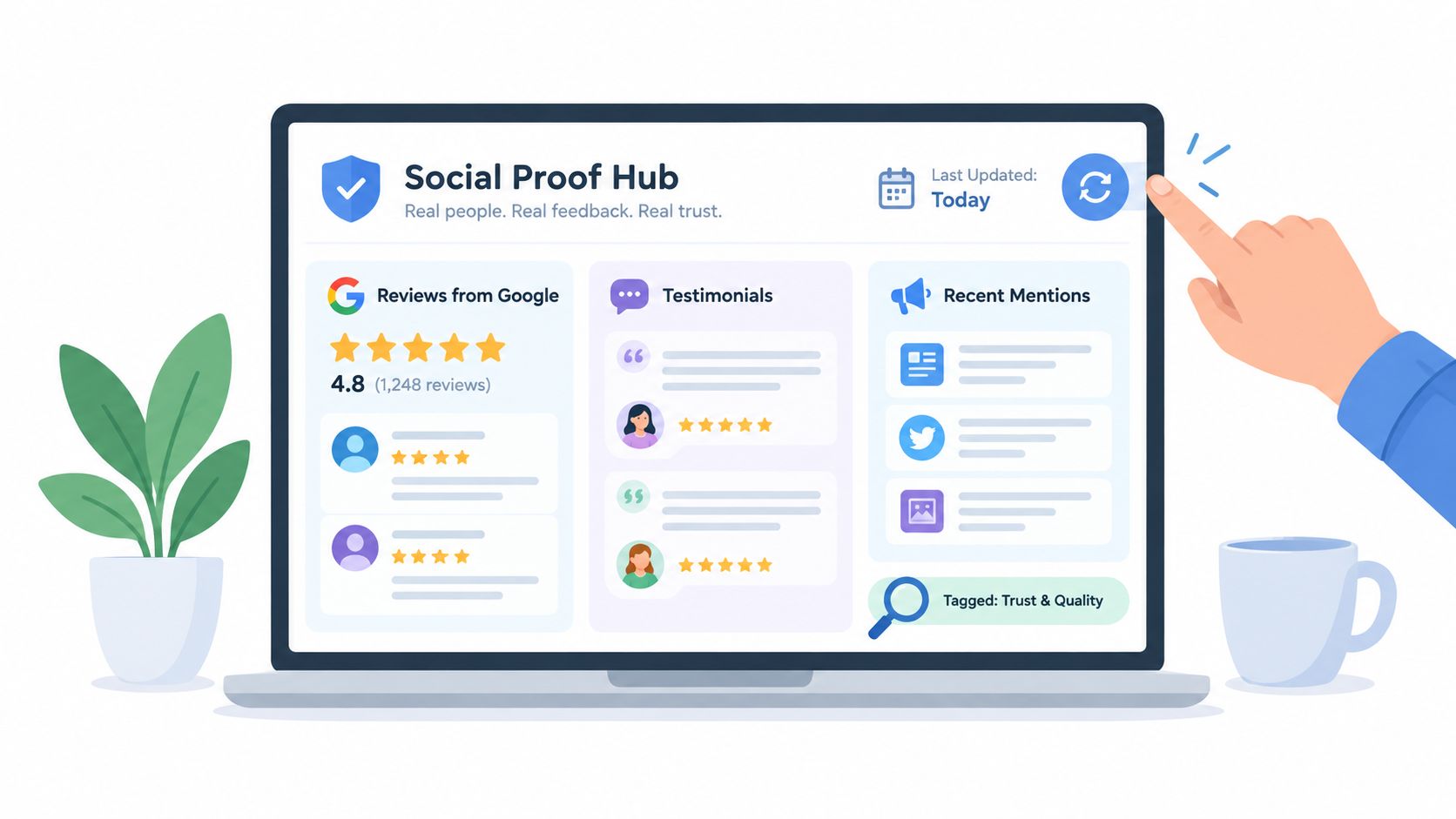
Build a lightweight review workflow
You don't need a huge system. You need a repeatable one.
A simple workflow usually includes:
- Collect in one place: Pull reviews and testimonials into a central source so teams aren't copying screenshots from scattered platforms.
- Tag by use case: Label proof by topic such as onboarding, product quality, support, pricing, ease of use, or industry fit.
- Match proof to page intent: Show product-quality comments on product pages, implementation comments on signup pages, and service reliability comments near checkout or contact forms.
- Retire weak assets: Remove proof that's vague, outdated, or tied to offers you no longer sell.
For teams that want one place to centralize and display reviews, Bragly is one option. It aggregates reviews from many third-party platforms, supports no-code widgets, includes tagging, and can keep displays current through auto-sync. If your bigger issue is stale displays, this guide on syncing reviews automatically is a practical starting point.
Measure what buyers actually respond to
Measurement doesn't need to be fancy. It just needs to be tied to a page and a decision.
Start by comparing versions of the same page with one variable changed. Move a testimonial closer to the CTA. Replace a vague quote with one tied to a buyer objection. Swap a logo strip for a short review excerpt. Then watch how users behave.
Good questions to track:
- Do more visitors reach the CTA?
- Do more visitors click or submit after seeing the proof?
- Which themes show up in the reviews that convert?
- Are people interacting with review elements or ignoring them?
Don't overwhelm the page
Piling on proof can make a page harder to scan.
A better approach is curation. Show the most relevant few items first. Let visitors open deeper review libraries only if they want more detail. AI summaries can also help teams spot repeated strengths or objections without reading every review one by one, but the final display should still feel human and concrete.
Curated proof is easier to trust than cluttered proof.
Putting Social Proof Conversion Into Action
If there's one idea to keep, it's this: better proof near the decision beats more proof everywhere.
That mindset keeps you from chasing volume for its own sake. It pushes you to ask sharper questions. What uncertainty is stopping the buyer here? Which real customer signal addresses it? Where should that signal appear so the buyer sees it before abandoning the page?
A practical next-step checklist
Use this as a quick audit:
- Pick one high-intent page. Start with a product page, pricing page, or lead form that already gets serious traffic.
- Find the main hesitation. Is the buyer worried about quality, fit, value, legitimacy, or risk?
- Choose one proof type that fits that hesitation. Don't add everything at once.
- Place it near the decision. Keep it close to the CTA, price, or form.
- Improve specificity. Replace broad praise with proof that mentions situation, role, problem, or use case.
- Test one change at a time. That's how you learn what moves behavior.
If you're also thinking about the wider conversion system around these pages, this guide on how to drive revenue with CRO is a useful companion because it helps place social proof inside a broader optimization process.
For teams that want a practical way to collect, manage, and publish reviews across important pages, this overview of social proof software can help you compare what kind of setup fits your workflow.
You don't need a massive testimonial library to improve social proof conversion. You need a handful of credible signals, shown where buyers hesitate, and a habit of refining what stays on the page.
Start small. Place one stronger piece of proof in one better spot. Then measure what changes.
Bragly helps teams collect, organize, and display reviews and testimonials across the pages where buyers are deciding. If you want a simpler way to centralize social proof, keep it fresh, and test different placements without heavy setup, visit Bragly.