
Looking for a Shorter Overview?
AI Summary
Key Moments
Tailor Testimonials to Buyer Doubts
Effective testimonials address specific hesitations based on buyer stage and page context rather than providing generic praise.Use Diverse Formats Strategically
Formats like star ratings, video, case studies, badges, and social media posts serve distinct purposes from quick trust signals to deep validation.Maintain Testimonial Quality Standards
High-quality testimonials are specific, clearly attributed, current, relevant to page claims, and reusable across layouts.Map Proof to Decision Points
Organize testimonial content to fit buyer questions and conversion tasks, ensuring proof directly supports page claims for maximum impact.The most common advice about testimonial content is also the least useful: add a carousel to every page and call it social proof. That approach treats every visitor the same, even though buyers arrive with different doubts. Some need instant reassurance that other people trust you. Some need proof that a specific feature works. Some need enough context to justify a bigger, slower B2B purchase.
The best testimonial is the one that answers the next question.
That's the practical standard I use when reviewing testimonial content examples. Not “does it look polished?” but “does it reduce the specific hesitation on this page?” A homepage hero has different proof needs than a pricing page, a retargeting ad, or a product-detail section. Strong testimonial content matches buyer stage, available space, and the kind of skepticism the reader brings with them.

I evaluate testimonial formats through five filters: specificity, credibility, context, placement, and ease of reuse. If a testimonial is vague, unattributed, outdated, or disconnected from the page's claim, it won't help much. If it's detailed, current, clearly sourced, and easy to republish in different layouts, it becomes a working conversion asset.
That's where systems matter. Bragly can help centralize reviews, tag them by use case, and publish them through no-code widgets, but the harder job is still editorial: choosing the right proof and writing it cleanly. If you want to see what that can look like in practice, browse these real user results.
1. Star Rating with Short Text Testimonial
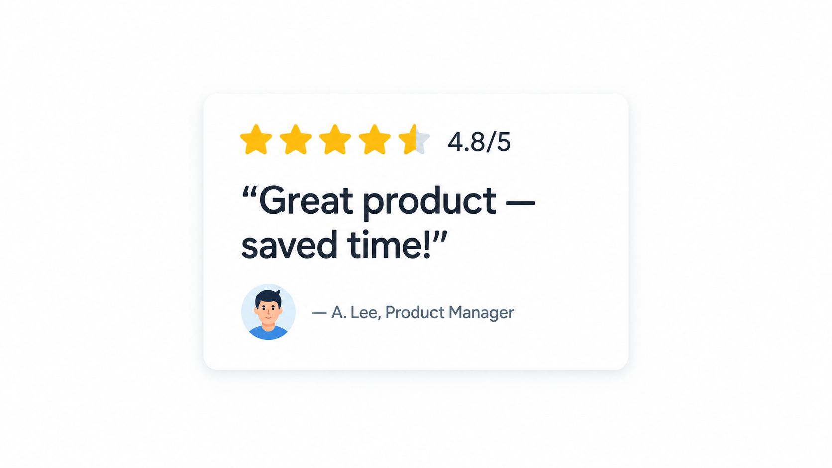
This is the fastest trust format on the page. A visible star rating plus one tight quote gives readers a quick answer to “Do people generally like this?” without forcing them to stop and study a long story.
It works best where attention is scarce. Product pages, pricing sections, service landing pages, sticky sidebars, and local business homepages all benefit from compact proof that's easy to scan.
Where it earns its place
A skincare product page might place a star summary near the add-to-cart button, then follow with three short quotes about texture, shipping speed, and results. A SaaS pricing page might pair each plan block with a one-sentence quote about ease of setup or team adoption. A plumber or contractor homepage can use this format above the fold because local buyers often compare options quickly across multiple review sites.
That last point matters more than many teams realize. In BrightLocal's 2026 survey, consumers reported consulting an average of six different review platforms before deciding, and 68% said they'd only use a business with four or more stars (BrightLocal review behavior data). If your short testimonials look inconsistent with your broader ratings footprint, buyers notice.
Practical rule: Use this format for reassurance, not persuasion. It should confirm trust fast, then send the reader deeper into product details.
What works and what doesn't
Good versions are specific. “Set up in one afternoon” beats “Great product.” Better still if the short quote names a feature, customer type, or outcome.
Use a visible aggregate rating, then rotate 3 to 5 snippets that speak to different concerns. If you need help choosing a display style, Bragly's guide to scale rating options is useful for deciding how to present ratings cleanly.
A weak version of this format usually fails in one of three ways:
- Generic praise: “Amazing service” doesn't answer any buying question.
- No source clarity: If buyers can't tell who said it, trust drops.
- Overstuffed layouts: Ten tiny review cards in one block create noise, not confidence.
2. Video Testimonial with Transcript
When a buyer wants to assess sincerity, video usually beats text. Tone of voice, pauses, body language, and environment all add credibility that a polished quote card can't always deliver.
That doesn't mean every page needs a long customer film. The useful version is short, relevant, and supported by text.
Why video works on high-intent pages
A B2B software homepage might feature a customer success manager explaining how the team rolled out the platform. A DTC brand might use a quick unboxing or usage clip near a product explainer. A consulting firm can place a customer interview beside the contact form to reduce hesitation before a demo request.
One conversion summary reported that video testimonials convert at 2 to 3 times the rate of written testimonials on high-intent pages, and it also recommended pairing them with above-the-fold review summaries, recent review dates within 3 to 6 months, and 3 to 5 outcome-specific excerpts (conversion-focused video testimonial guidance). That's directionally useful because it shows video performs best when it's curated, not just embedded.
For examples of how teams structure this format, these HomeProBadge testimonial examples show the range between direct-to-camera clips and more produced customer stories.
Always add the transcript
The transcript isn't a backup. It's part of the asset.
A transcript helps readers who can't or won't press play. It also gives you reusable copy for sales pages, ads, feature pages, and onboarding content. If the customer says something strong in the video, pull that line into a visible text excerpt beneath the player.
Keep the production clean but not overproduced. If the video feels scripted, viewers start asking whether the endorsement is real.
Include the customer's name, role, company, and context line above the video when appropriate. Add captions. Put a clear CTA nearby. Don't hide the proof in a gallery page nobody visits.
3. Case Study Testimonial
This is the format for buyers who won't move on a quote alone. Case studies do the heavy lifting when the purchase is expensive, complex, cross-functional, or risky.
A strong case study testimonial doesn't just say the customer liked the experience. It documents the initial problem, the selection logic, the implementation, and the result in enough detail that a similar buyer can see themselves in the story.
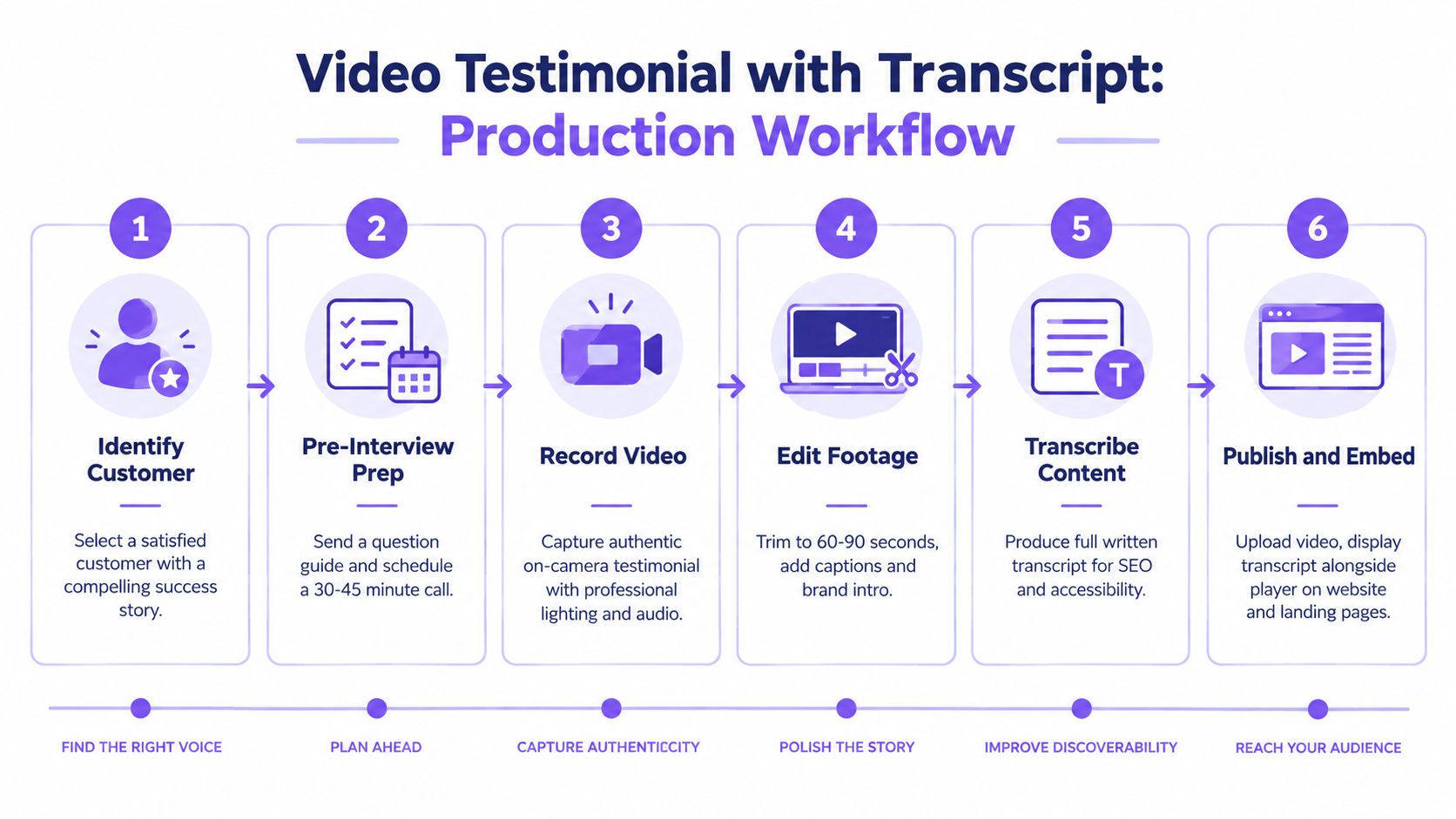
To visualize the production side, this workflow is a good reminder that long-form testimonial content usually comes from a repeatable process, not a last-minute content request.
Best for B2B evaluation
Think about where this belongs. On a SaaS site, case studies usually work best in resource hubs, industry pages, and sales follow-up emails. On an agency site, they often outperform generic testimonials on service pages because they show process and decision quality, not just satisfaction.
One source compilation on testimonial marketing reported that 97% of B2B customers cite testimonials and peer recommendations as the most reliable type of content (B2B testimonial benchmark). That lines up with how enterprise buyers behave. They want narrative proof, not just approval signals.
A reliable structure is simple:
- Customer context: Industry, team size, operating environment
- Core problem: What wasn't working before
- Implemented solution: What changed operationally
- Customer language: Short embedded quotes at key moments
- Result: Whatever the customer is willing to state clearly and publicly
If you need a framework for collecting those details, Bragly's testimonial template guide can help shape customer prompts so you don't end up with empty praise.
Here's a useful example of how a customer story can feel more concrete when spoken, then supported in writing:
The trade-off
Case studies build the deepest confidence, but they take the most work to collect, approve, and keep current. That's why they shouldn't replace lighter testimonial formats. They should anchor your proof library for late-stage evaluation.
4. Social Proof Badge and Micro-Testimonial
Big testimonial assets get attention. Small proof elements get clicks.
A social proof badge paired with a micro-testimonial handles a narrow job: reduce hesitation at the exact moment a visitor is about to act. Use it when the reader does not need a full story yet. They need one fast reason to trust the page enough to continue.
This format works best in high-friction placements: hero sections, signup modules, pricing pages, checkout steps, sticky bars, and button-adjacent areas. On those surfaces, space is limited and attention is split. A compact rating, review count, or source badge plus one specific line of customer language can steady the decision without slowing the page down.
Use this format for instant credibility, not detailed persuasion.
The micro-testimonial itself should do one job well. Validate ease of setup. Confirm reliability. Reinforce support quality. Back up a risky claim with plain language. If the quote tries to summarize the whole product, it turns vague fast.
Placement matters as much as wording. A star summary under a bold headline can soften skepticism on a landing page. A review badge beside a form can reduce anxiety before submission. A short quote near a checkout CTA can reassure buyers who are already comparing risk, not features. For local and service businesses, LocalHQ's review solution is a useful example of how review collection and display can support that kind of compact proof layer.
There is a trade-off. Badges are efficient, but they have shallow explanatory power. They support a claim. They do not carry a complex sale, justify premium pricing, or answer detailed objections. If the page asks the visitor to believe something substantial, pair the badge with a path to stronger proof lower on the page.
For teams testing layouts, Bragly's overview of social proof software options for widgets and on-page proof is relevant. The format choice affects performance. A small strip or badge often fits better than a carousel on crowded pages, especially when the conversion task is simple and immediate.
Keep the execution tight. Use a real attribution signal when possible. Keep the quote short. Make sure the badge supports the page's conversion task, rather than competing with it.
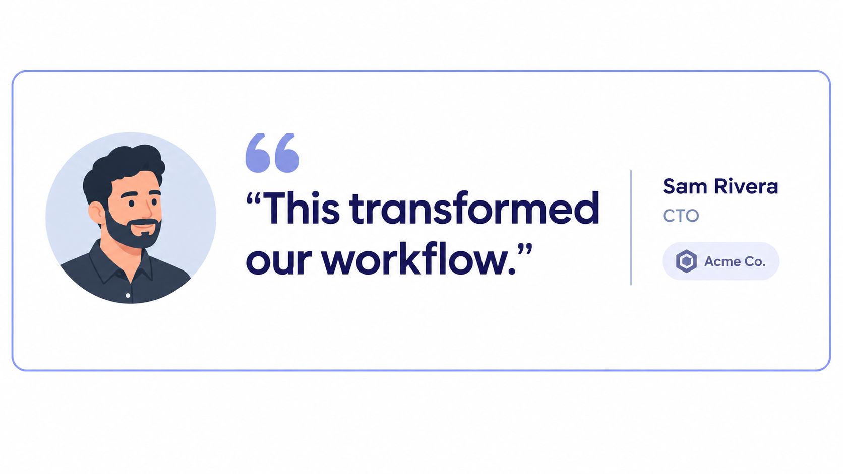
5. Customer Quote Card with Visual Profile
Quote cards are the most versatile middle ground. They provide more personality than star snippets and take less commitment than case studies or video.
A good quote card includes the customer's words plus a visual identity layer such as a headshot, name, title, company, or industry label. That extra context helps readers decide whether the speaker feels relevant to them.
Why this format travels well
You can use quote cards almost anywhere: homepage sections, product pages, About pages, sales decks, webinar slides, event booths, and proposal documents. They're modular, which makes them one of the easiest testimonial content examples to repurpose.
They're especially useful when the buyer needs human context. A quote from a VP of Operations lands differently than a quote from a founder or a solo consultant. The card tells readers not just what was said, but who said it and from what perspective.
The visual profile isn't decoration. It's part of the credibility layer.
What to include
The sweet spot is usually one meaningful paragraph, not a wall of text. You want enough detail to sound real, but not so much that scanning becomes work.
Use a consistent card design, but vary the testimonial substance:
- Role relevance: Match the speaker to the page's likely reader.
- Outcome clarity: Highlight a specific change, relief, or operational win.
- Context cues: Add company name or customer type when that helps trust.
- Visual restraint: Keep the headshot supportive, not dominant.
This format does break down in privacy-sensitive industries. In those cases, partial names, company category labels, or role descriptions may be more appropriate than a full public identity. The point is still attribution. It just needs to respect the context.
6. Feature-Specific Testimonial with Benefit Statement
This is one of the most underused formats, and one of the most persuasive on product pages.
Instead of collecting broad praise about the brand, map customer quotes to individual features. If your product has automation, reporting, onboarding, analytics, or integrations, each major capability should have proof attached to it.
Where this format wins
A project management platform can place one quote under collaboration, another under timeline planning, and another under reporting. An email platform can match testimonials to segmentation, automation, and deliverability workflows. An ecommerce operations tool can do the same for inventory, fulfillment, and returns.
The reason this works is simple. Buyers evaluating features don't need general trust. They need validation that the exact thing they care about helps in real use.
Independent reporting in 2026 noted that reviews with images were associated with 28% higher conversion rates, and that 95% of retailers display customer reviews on product pages (review statistics roundup). The main lesson isn't “add more reviews everywhere.” It's that product-page proof is now expected, and visual reinforcement helps.
How to make feature proof believable
A feature-specific testimonial should answer three questions fast:
- What feature was used
- What problem it solved
- What changed after using it
If the quote doesn't make the benefit obvious, add a short editorial sentence above or below it. Don't rewrite the customer into marketing copy. Just clarify the connection.
Retire outdated quotes when the product changes. Nothing weakens this format faster than praising an old interface, naming a removed feature, or describing a workflow your product no longer uses.
This structure also gives sales teams better proof assets. Instead of sending a giant testimonial page, they can pull the exact quote that supports the prospect's top requirement.
7. Comparative Testimonial
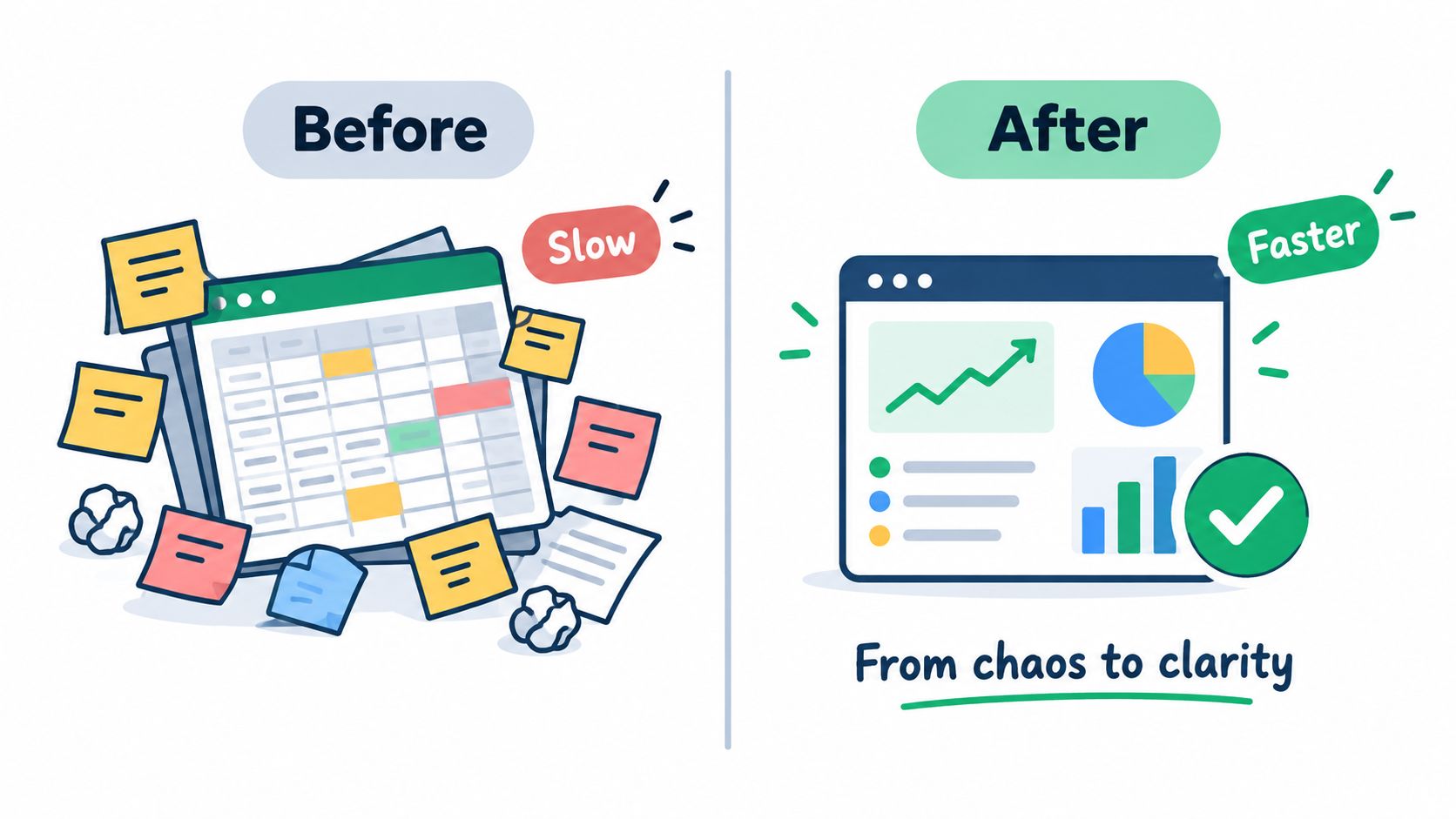
Comparative testimonials are built around contrast. Before and after. Old way and new way. Pain point and relief.
That framing works because it helps buyers diagnose themselves. When readers see a problem described in familiar language, they can quickly decide whether the testimonial applies to their situation.
Useful on objection-heavy pages
This format fits landing pages, competitor-alternative pages, solution pages, and bottom-of-funnel product sections. A payroll tool might feature “we used to spend Fridays cleaning up errors, now the run is routine.” A CRM company might use “we had lead data in three places, now sales and support work from one record.”
Large social-proof benchmarks have cited a 34% conversion increase from customer testimonials on sales pages, and another reported that displaying five or more customer reviews can raise purchase likelihood by 270% versus no reviews (sales page trust-signal benchmarks). Comparative testimonials are one of the formats most likely to earn that lift because they make the change legible.
The structure matters more than the polish
A useful comparative testimonial usually includes:
- Before state: Specific friction, confusion, delay, or risk
- Decision trigger: Why the customer looked for a new option
- After state: Clear operational or emotional improvement
- Scope cue: Team, use case, or workflow context
If the “before” side is vague, the “after” side won't feel credible.
Don't overedit the customer's contrast language. Phrases like “previously,” “instead of,” “since switching,” and “now” do real work here. Keep them. They make the transformation easier to picture.
8. Social Media Native Testimonial
Social-native testimonials do a different job from polished website quotes. They create instant credibility by showing that a customer chose to say something positive in public, in their own words, on a platform they already use.
That matters most when a buyer is still asking, “Do real customers talk about this product without being prompted?” A public LinkedIn post, an Instagram story, a Reddit comment, or a short TikTok mention can answer that faster than a formal testimonial block.
Best use: fast trust on landing pages, ads, and signup paths
This format works well near decision points where buyers need a quick credibility check, not a long proof sequence. Good placements include landing pages, paid social ads, signup flows, comparison pages, and testimonial widgets.
A strong social-native example usually does one of three things:
- Confirms real usage: the customer shows the product in context
- Validates a result: the post names a win, fix, or improvement
- Signals spontaneous approval: the endorsement does not read like requested copy
Use social-native proof when the buyer needs authenticity fast, not when they need a full explanation.
For ecommerce and self-serve SaaS, this can outperform a longer quote in tight spaces because the platform context does part of the persuasion work. For B2B, it is usually supporting proof, not primary proof. A buyer may trust a founder's LinkedIn post or a client executive's comment, but larger deals still need deeper evidence elsewhere on the page.
Embeds and screenshots solve different problems
Native embeds preserve context. The profile, timestamp, comments, and platform UI help a reader judge whether the post feels real. That makes embeds useful on product pages and social proof walls where inspection matters.
Screenshots are easier to control. They load faster, fit your layout, and do not break when platforms change formatting. They are often the better choice for landing pages, mobile-first sections, and ad creative.
The trade-off is simple. Embeds provide stronger verification cues. Screenshots provide better design stability.
Republish carefully or the proof loses value
Permission comes first. Public does not automatically mean reusable in marketing.
Keep the original wording as intact as possible. Light cleanup is fine for readability, but heavy editing defeats the reason to use this format. The rough edges often carry the credibility.
Trust is also stricter here than teams expect. Buyers inspect social-native proof for signs of manipulation, stale posts, and selective cropping. Include date context and clear identity cues. If the person is not widely known, add a short label such as role, company type, or use case so the reader can place the endorsement quickly.
If a social testimonial looks too polished, it starts doing the wrong job.
Use this format to capture public enthusiasm and product-in-use validation. Use another format when the page needs quantified outcomes, objection handling, or a before-and-after story.
8 Testimonial Content Formats Compared
| Format | Implementation complexity | Resource requirements | Expected outcomes | Ideal use cases | Key advantages |
|---|---|---|---|---|---|
| Star Rating with Short Text Testimonial | Low | Minimal, short quotes and star graphics | Quick trust signal; improved conversions | Product pages, landing pages, sidebars | Visual credibility, space-efficient |
| Video Testimonial with Transcript | High | High, recording, editing, hosting, captions, transcript | Strong emotional impact; longer page engagement; SEO benefits | Homepages, B2B success stories, case pages | High authenticity; body language reinforces credibility |
| Case Study Testimonial (Long-Form) | High | High, interviews, writing, design, data collection | Deep validation; sales enablement; SEO value | Enterprise B2B, sales nurture, gated resources | Detailed outcomes and ROI; thought leadership |
| Social Proof Badge and Micro-Testimonial | Very low | Minimal, verified metrics and badge design | Immediate trust cue; high read-completion | Hero sections, CTAs, footers, form areas | Extremely compact; mobile-friendly; quick trust |
| Customer Quote Card with Visual Profile | Medium | Moderate, photos, attribution, card design | Enhanced credibility and personalization | Testimonial galleries, carousels, about pages | Humanizes brand; photo increases trust |
| Feature-Specific Testimonial with Benefit Statement | Medium | Moderate, curated quotes tagged by feature, optional screenshots | Validates specific capabilities; aids feature evaluation | Feature pages, comparisons, product detail views | Directly ties features to user value; targeted relevance |
| Comparative Testimonial (Problem-Solution Format) | Medium | Moderate, before/after metrics and narrative collection | Clear cause-and-effect proof; high relatability | Conversion pages, problem-focused landing pages | Demonstrates impact with before/after contrast |
| Social Media Native Testimonial (Screenshot or Embed) | Low–Medium | Low, monitoring, permission management, embed/screenshot assets | Authentic organic endorsement; social credibility | Homepages, social proof sections, marketing pages | Genuine user voice; easy UGC sourcing and social signals |
Match the Proof to the Moment
The right testimonial format depends on what the page is trying to do. Ratings and badges handle fast reassurance. Quote cards add human context. Feature-specific and comparative testimonials help buyers evaluate claims and resolve objections. Video adds emotional credibility. Social posts add organic validation. Case studies carry the load when the decision is complex and the buyer needs detail.
The biggest mistake is treating all positive feedback as equally useful. It isn't. A testimonial should support a claim already being made on the page. If the page promises ease of onboarding, the proof should speak to setup, adoption, or ramp time. If the page sells a specific feature, the testimonial should mention that feature directly.
An audit usually exposes the weak spots fast. Check each testimonial for five things: a specific claim, an identifiable source, relevant placement, permission to use it, and freshness. Those standards matter because buyers are already conditioned to verify social proof. A 2024 survey commissioned by Reputation found that 54% of consumers put their trust in online reviews first, ahead of friends and family at 24%, company claims at 18%, social media influencers at 2%, and media reviews at 2% (Reputation consumer trust survey). Buyers don't just like testimonials. They rank them above what brands say about themselves.
That trust behavior is broad, not niche. Pew Research Center reported that 82% of U.S. adults said they at least sometimes read online customer ratings or reviews before purchasing items for the first time, and 40% said they always or almost always do so (Pew online reviews data). BrightLocal's 2024 survey adds another practical signal: 75% of consumers said they always or regularly read online reviews, and 50% said they trust reviews as much as personal recommendations from friends and family (BrightLocal 2024 local review survey).
So the job isn't collecting more praise. The job is curating proof that fits the decision point. Start by mapping your pages to buyer questions. Then assign the testimonial format most likely to answer each one clearly.
If you want a workable implementation path, collect first-party testimonials in a structured way, aggregate reviews from the platforms your customers use, tag them by feature, audience, and page goal, and publish them in layouts that fit the space. Bragly is one option that supports that workflow through review collection, source aggregation, tagging, and no-code widgets. That setup won't choose the proof for you, but it does make it much easier to keep the right proof current and reusable across your site.
Bragly helps teams collect first-party testimonials, pull in reviews from supported third-party platforms, organize them with tags, and publish them in no-code widgets that fit different pages and proof jobs. If you want your testimonial content examples to be easier to manage and easier to place well, visit Bragly.